

Gather
This project was originally developed as a rebrand pitch for a foraging and dining experience set in the woodland, which wasn’t taken forward. This case study shows the creative direction I explored, reimagined here with a new name.
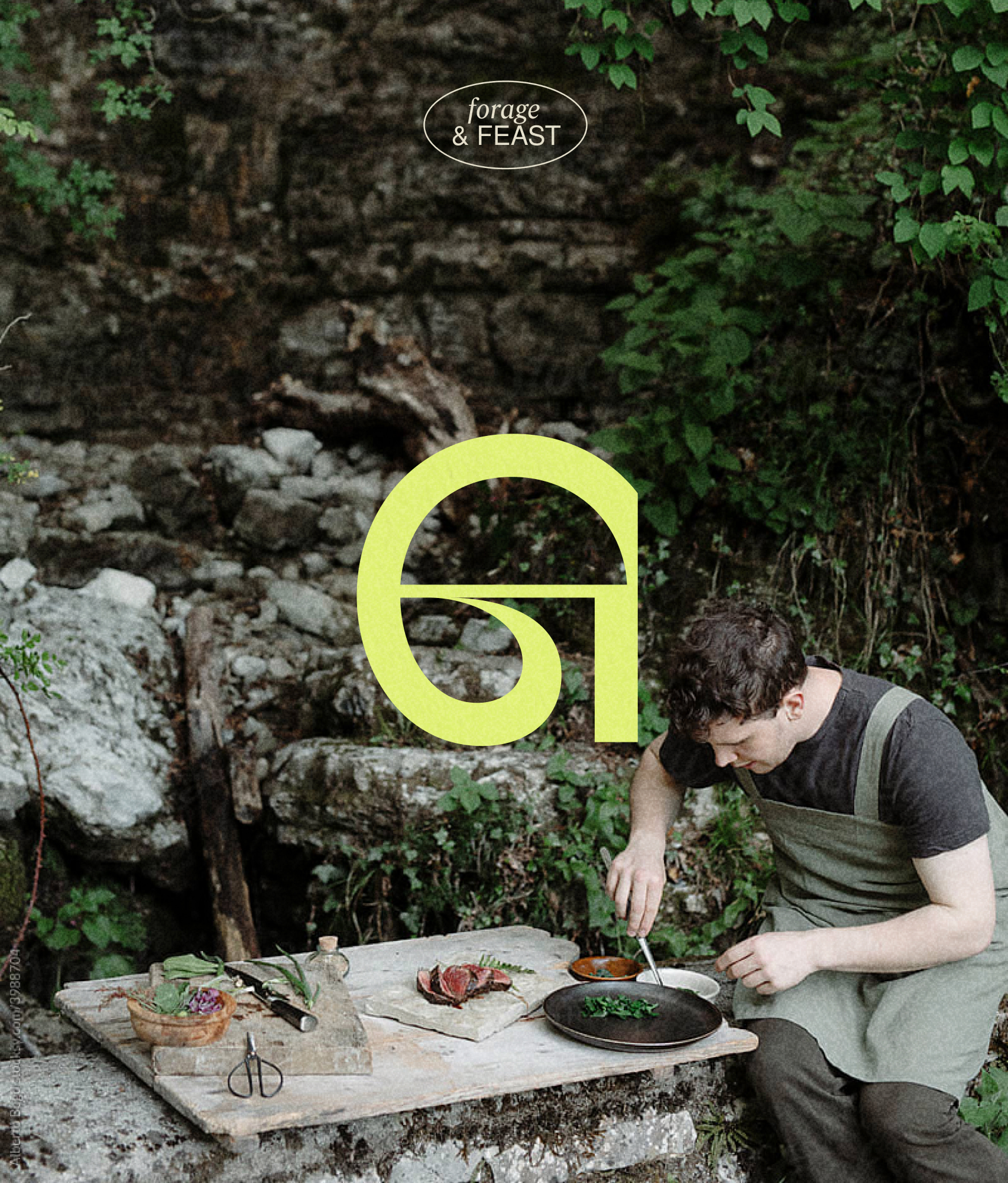
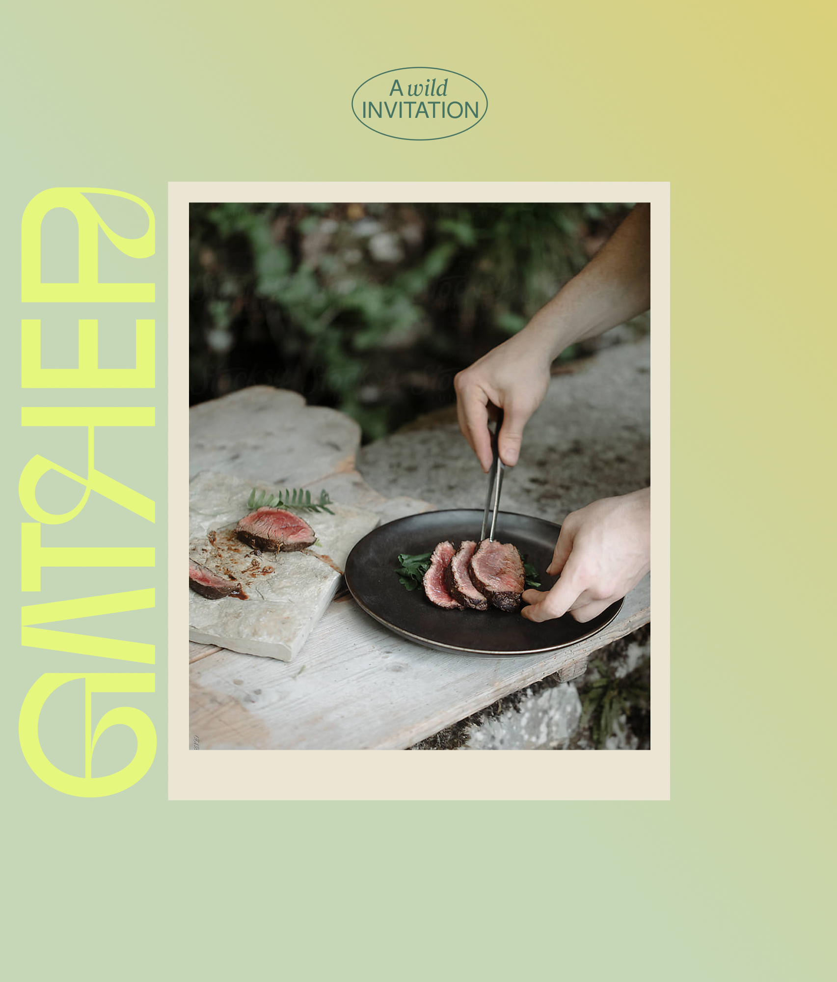
‘Gather’ captures everything the experience offers: gathering forage, gathering ingredients on a plate, gathering around a table.
From the moment guests arrive, the sensory experience unfolds. The scent of pine in the air, earthy textures underfoot, wild ingredients waiting to be discovered, smoke drifting from the firepit, shared food and conversation beneath the trees.



With Wild Abundance
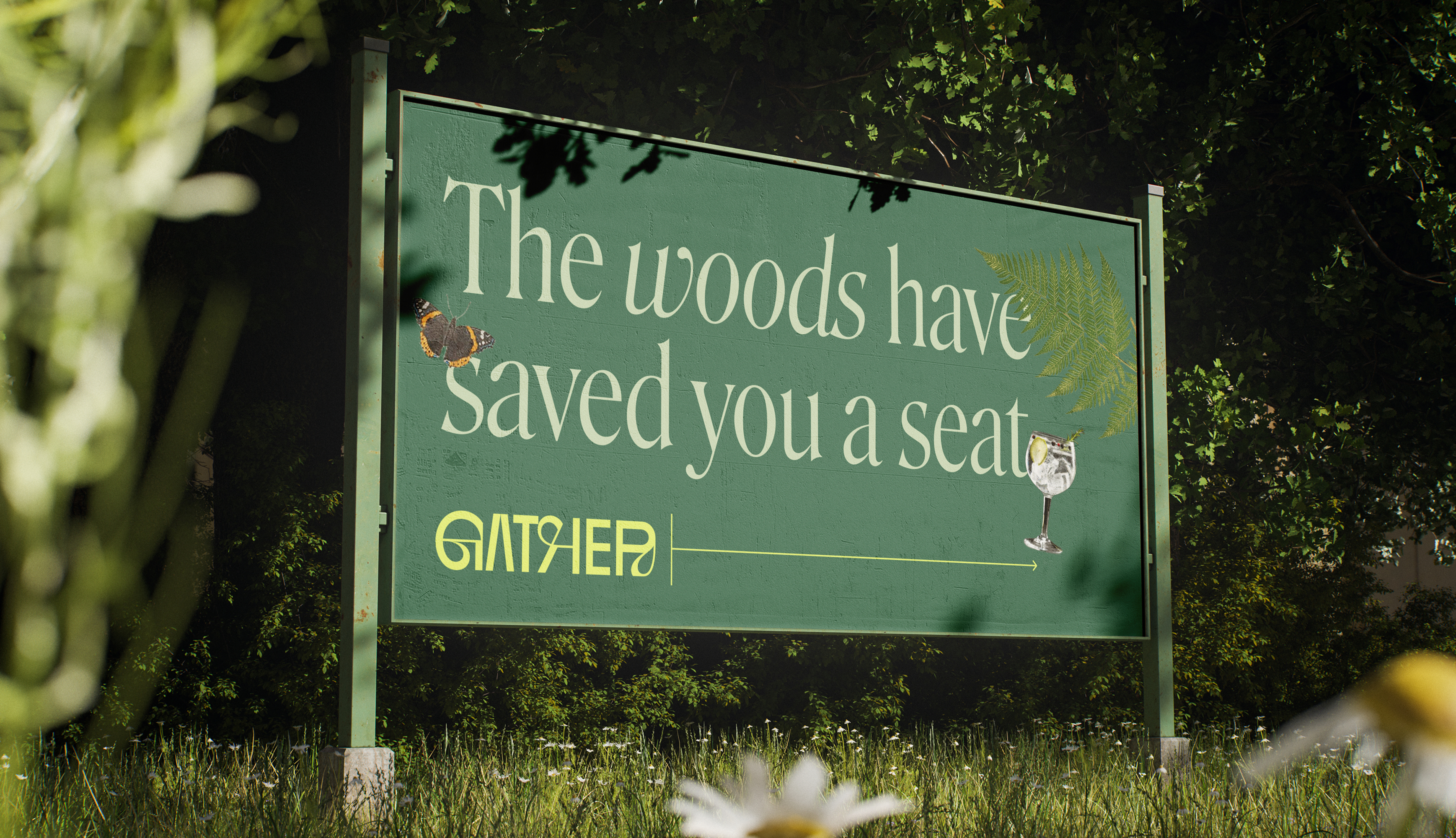
The brand concept With Wild Abundance is a play on ‘with wild abandon’. This reflects the experience's invitation for curiosity and connection, immersed in the abundance of the woodland's forage.
This direction comes to life through a balance of earthy depth and unexpected accents, drawing guests into the story before they’ve stepped foot in the woodland.



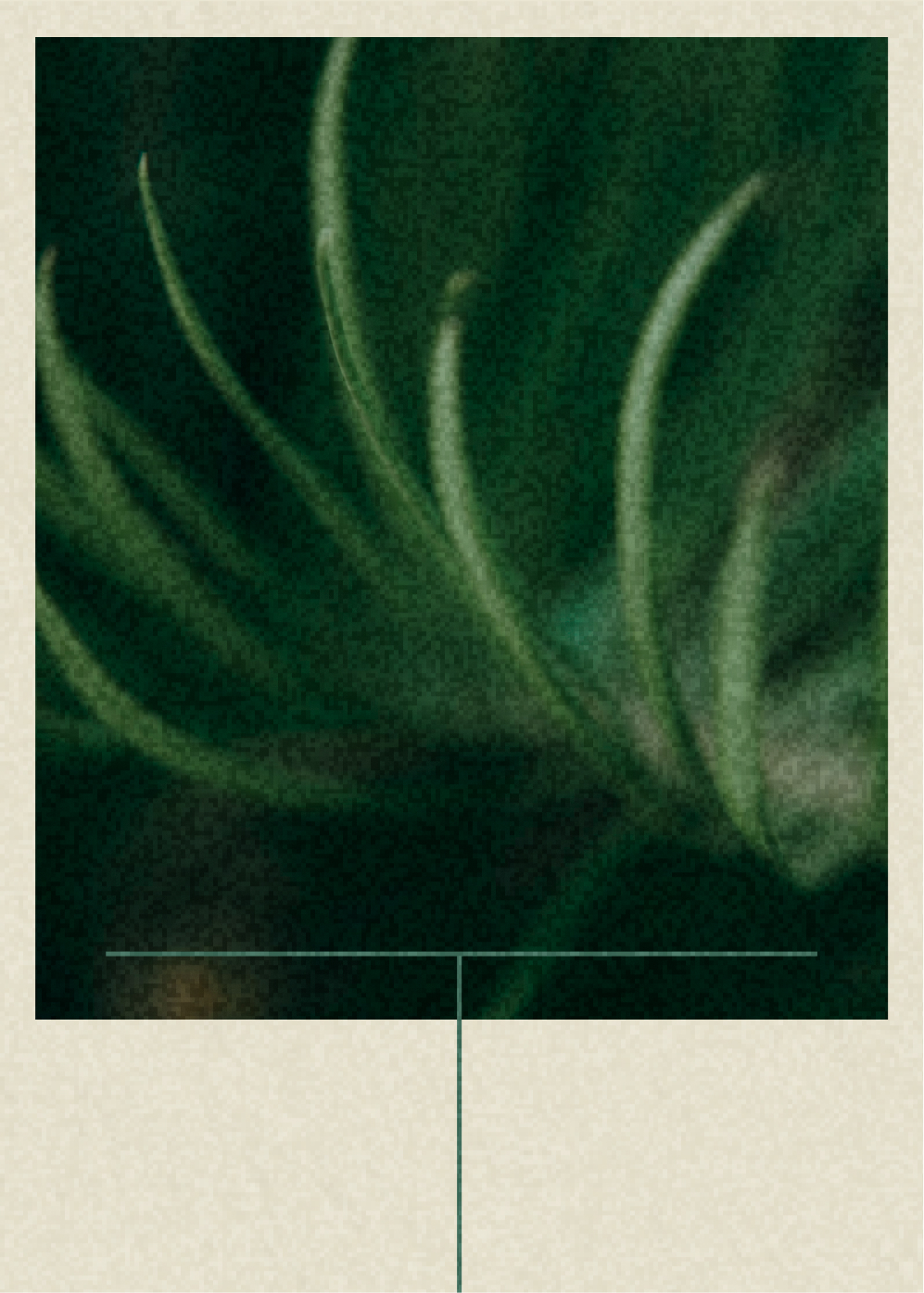 Forest Pine
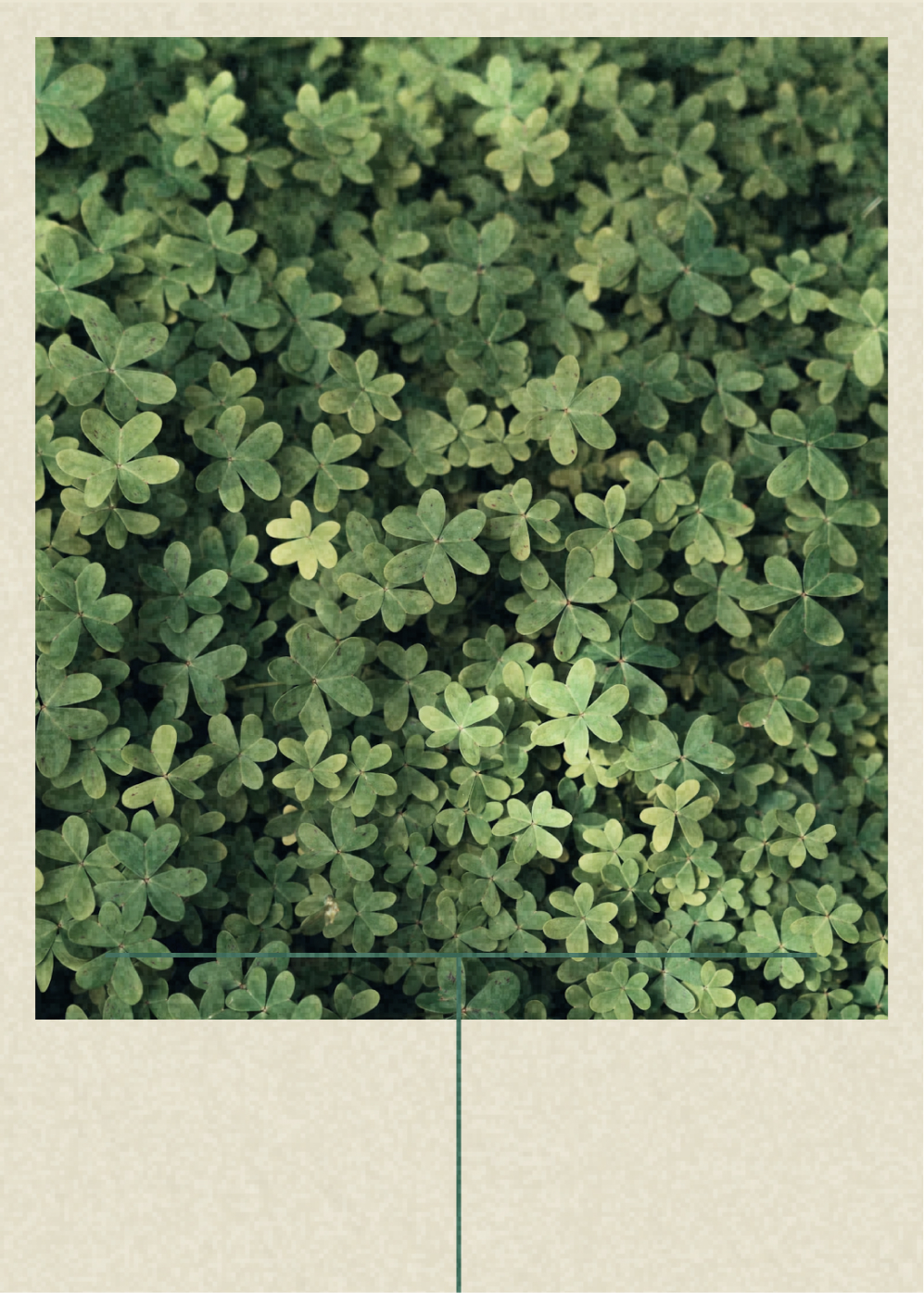 Wood Sorrel
 Field Mushroom
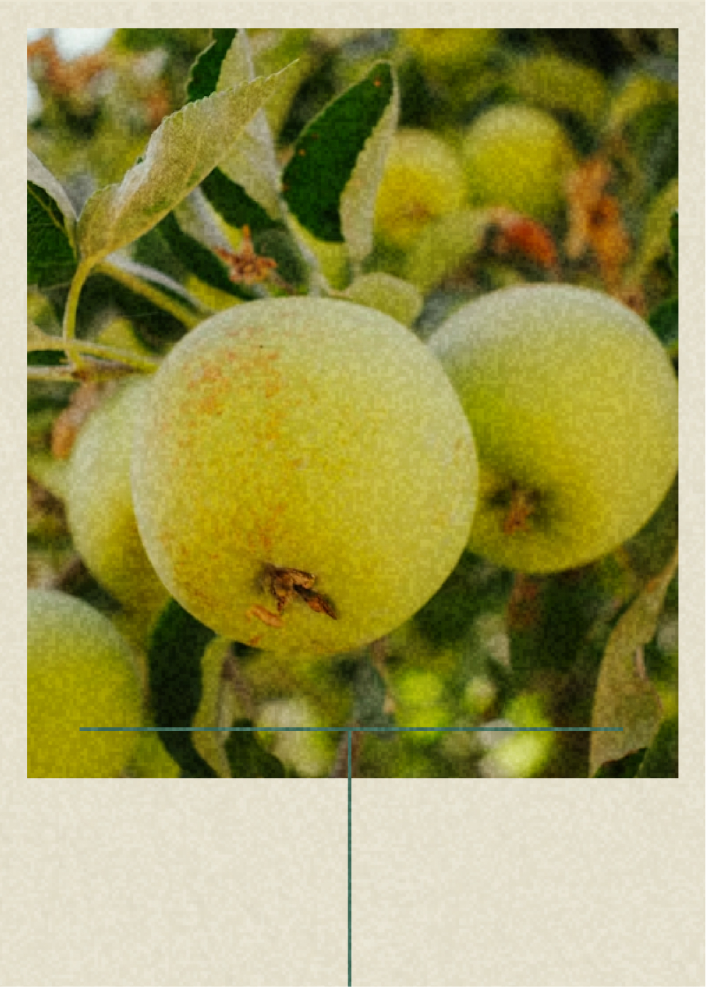 Crab Apple
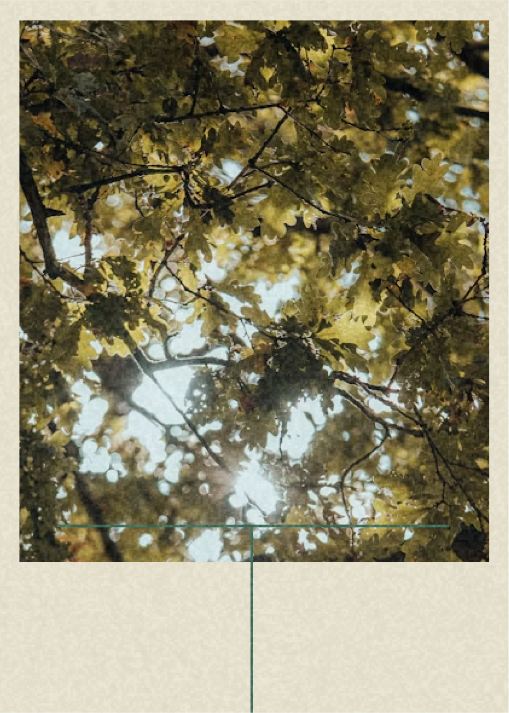 Canopy Light
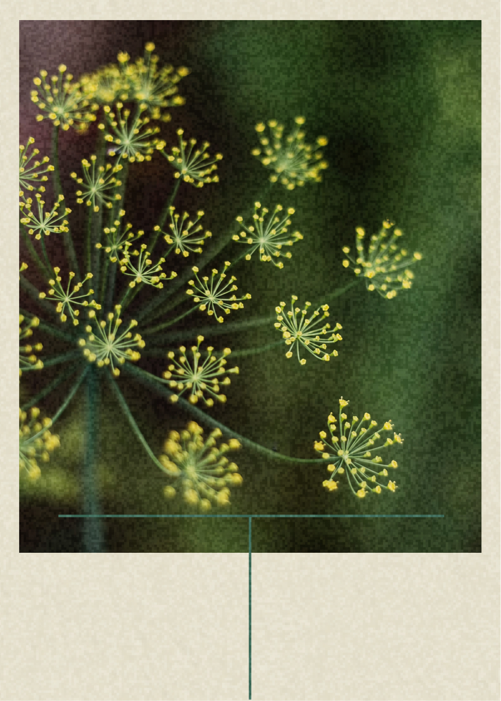 Wild Fennel
Field Journal
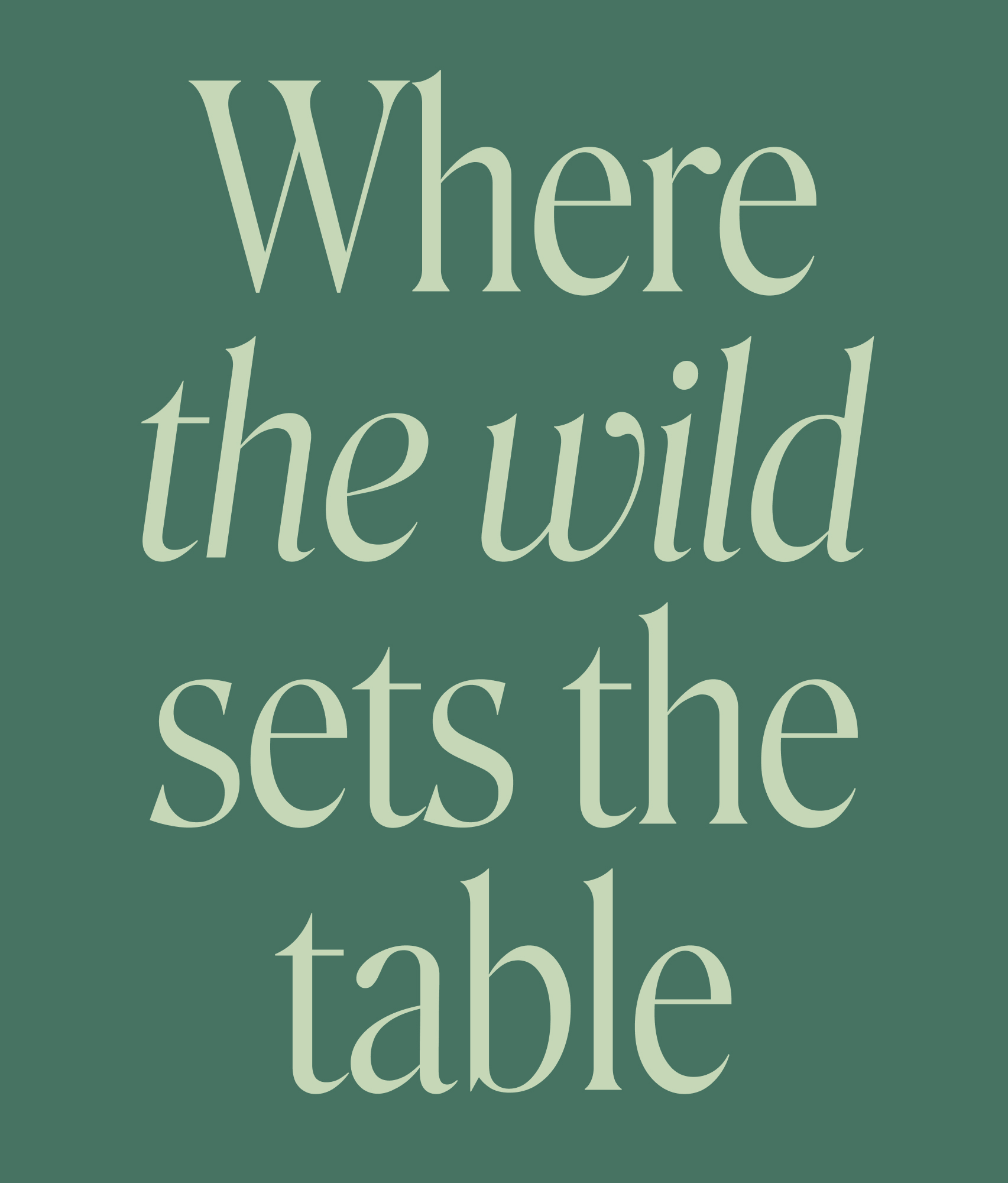
The colour palette is inspired by a morning spent foraging within the setting’s ever-changing colour and light. Deep pine green and soft, earthy tones come from the surrounding woodland. The gradient reflects sunlight through leaves, and bright yellows are a spark of discovery in the wild.
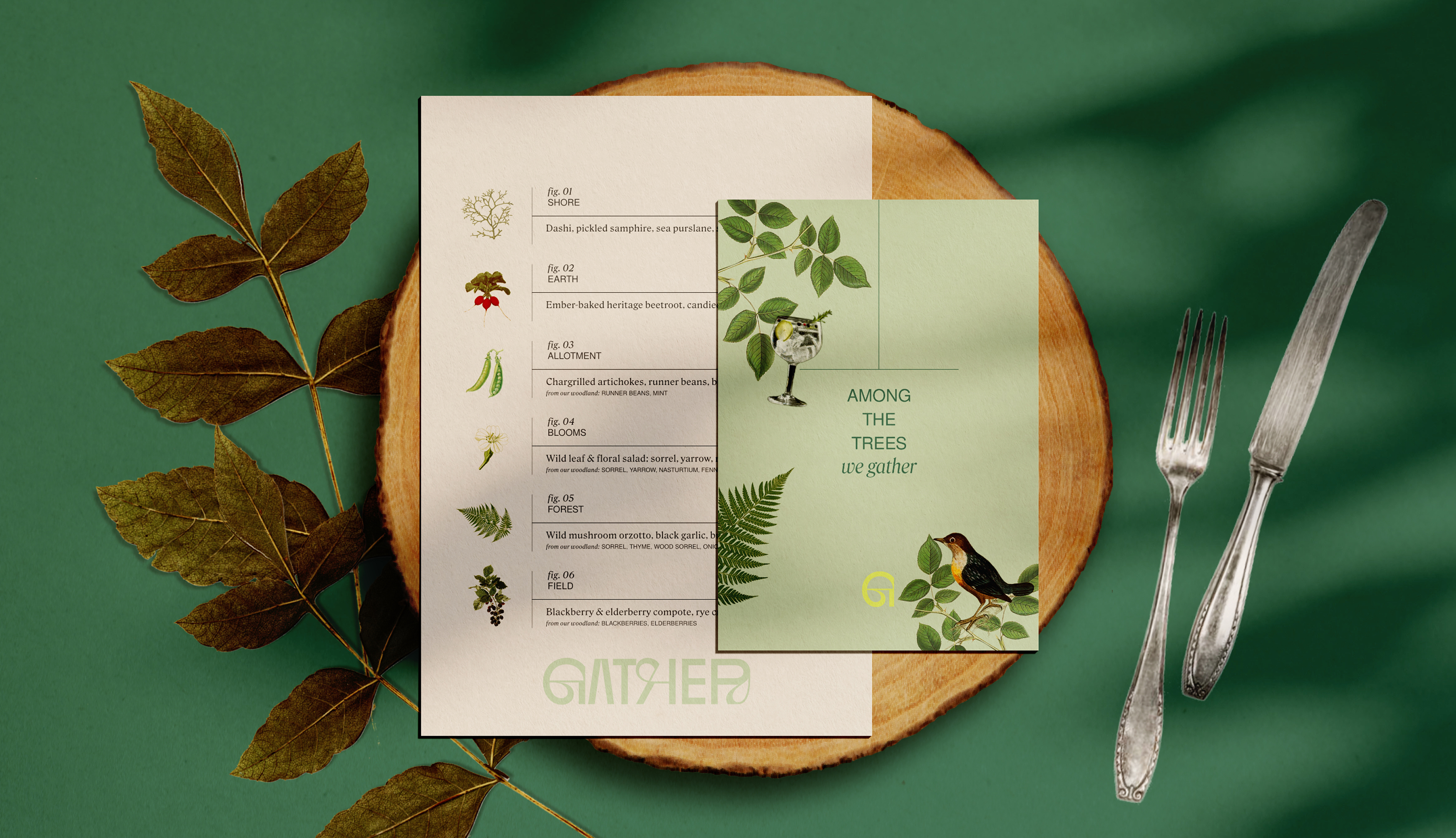
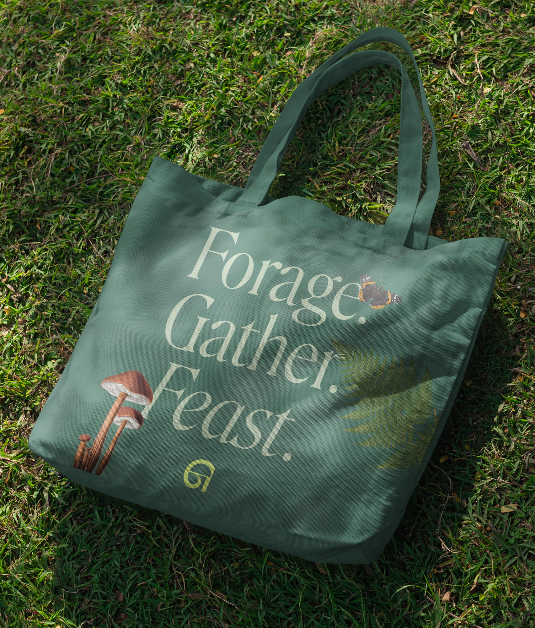
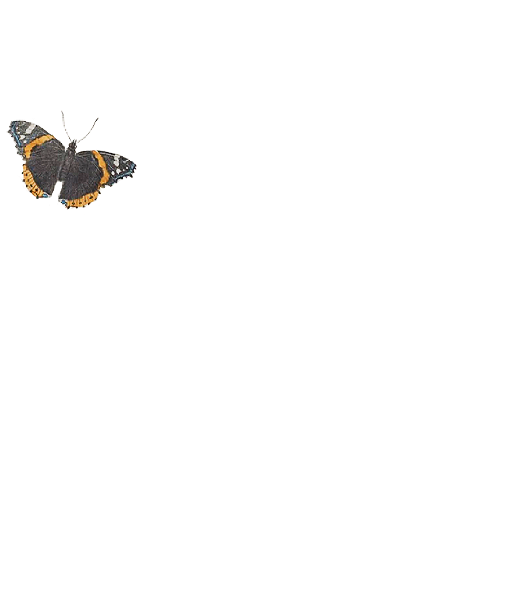
The surrounding identity builds on the sensory story. Illustrations are layered like foliage, tactile and immersive, collaged from vintage botanical prints. Subtly playful animation brings these to life on digital applications. The type system borrows from specimen-style annotations. Together, they become a modern field journal, and an invitation to gather among the trees.