Oasis
Oasis is a hypnotherapy and coaching practice supporting women's mental and physical wellbeing. It began with a time of transformation for founder Rachel, after losing a close friend. The word ‘oasis’, found in a letter from that friend in the time afterwards, captured everything she hoped to offer: relief, renewal, and the chance to grow, even in life's harshest conditions.
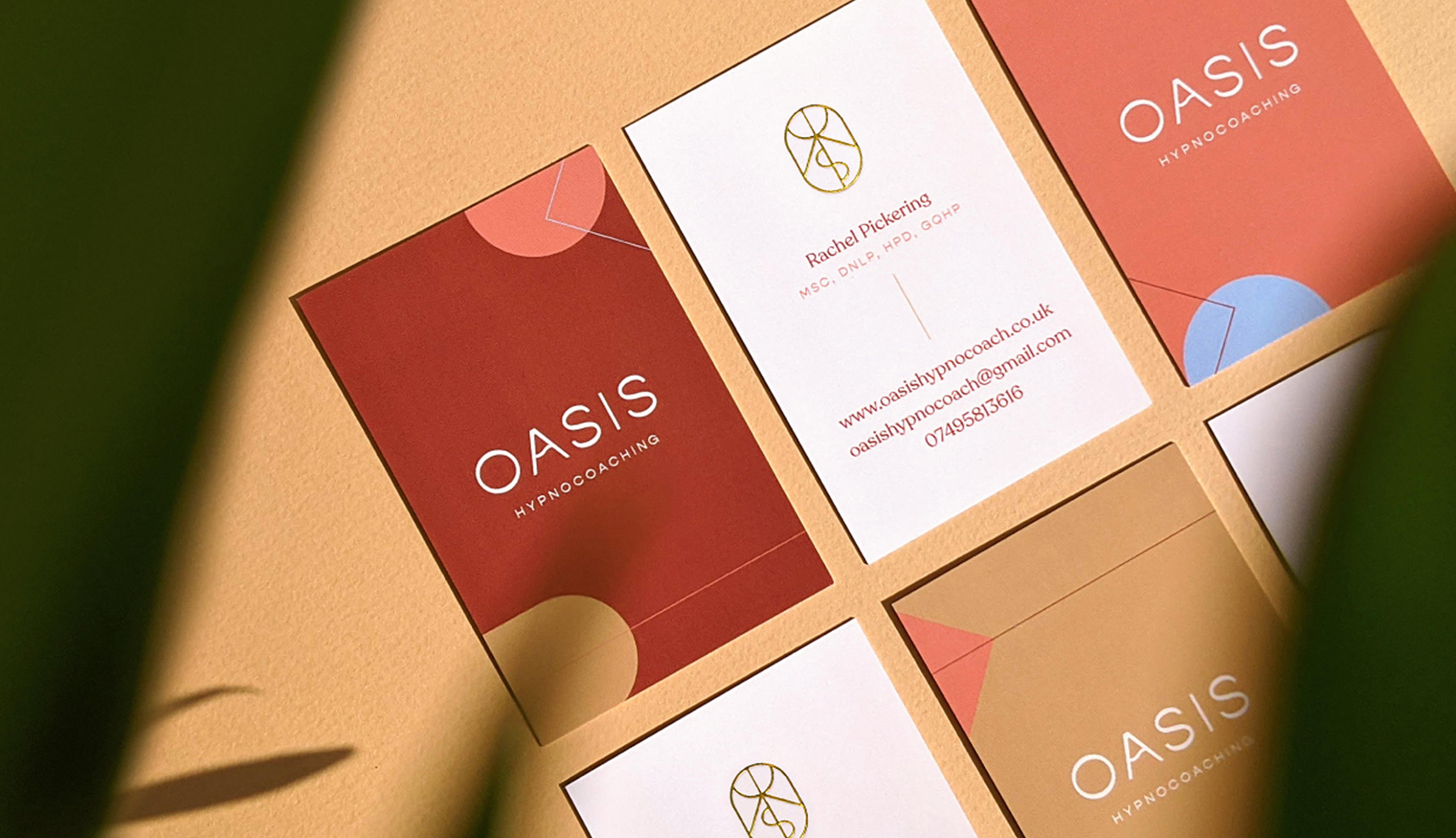
Calm and Growth
Rachel wanted Oasis to be ‘a place of calm and personal growth.’ Her words became the creative direction.
The identity gives shape to that vision, balancing the stillness of finding peace with the gentle momentum of moving forward. Oasis is a place to pause, take a breath, and start to feel like yourself again.
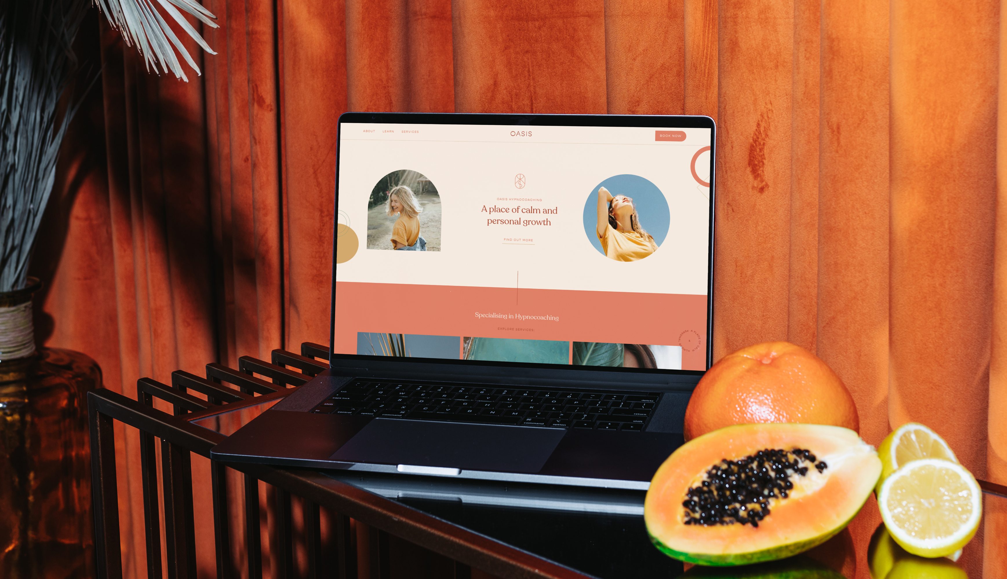
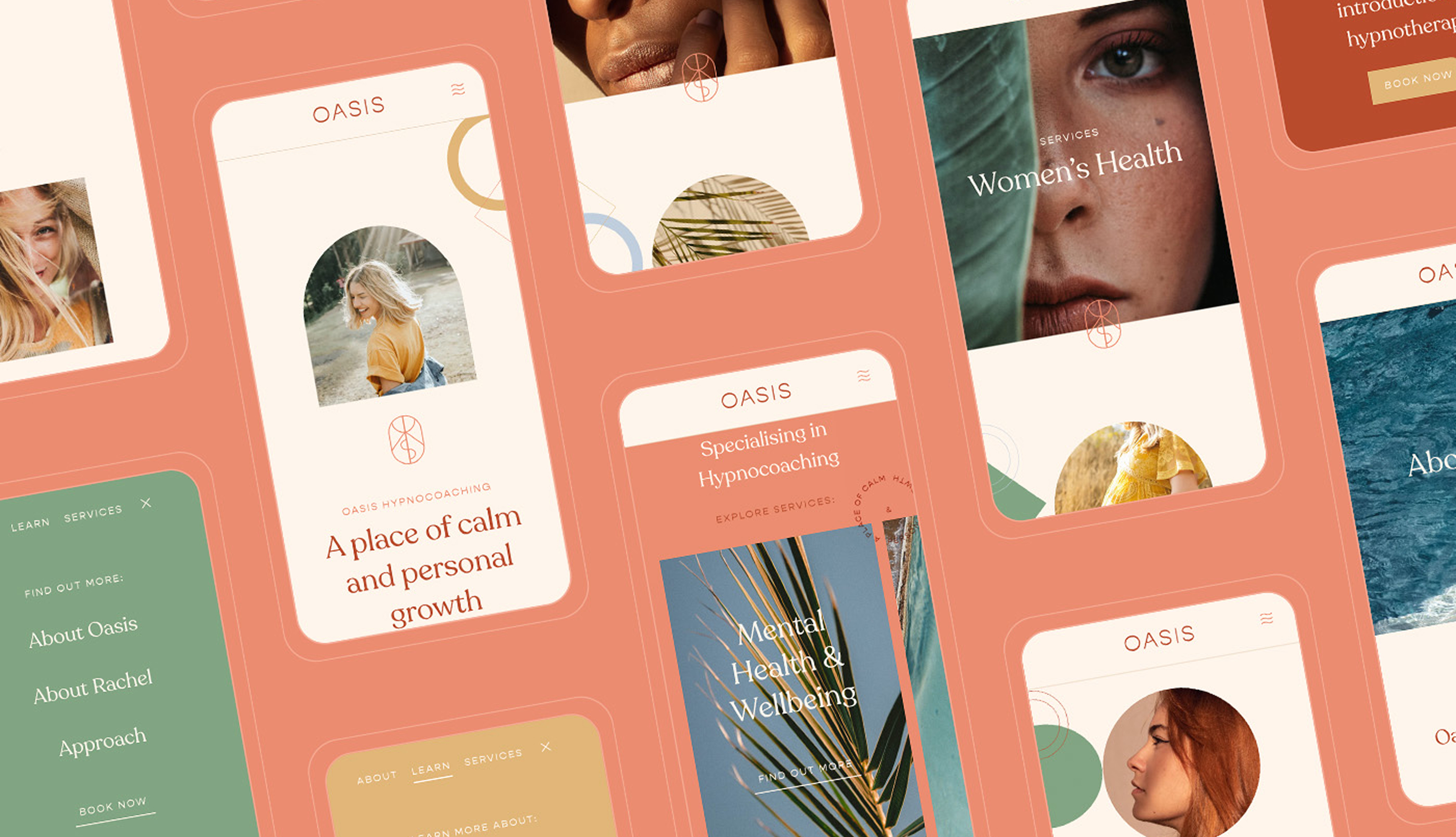
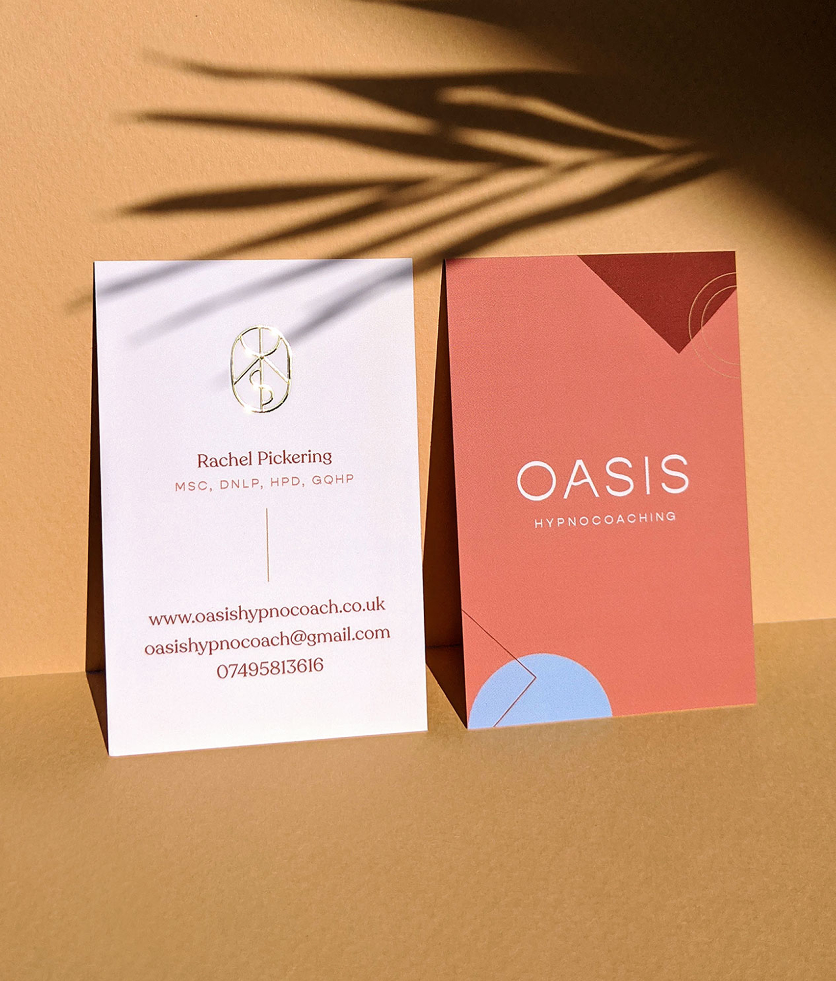
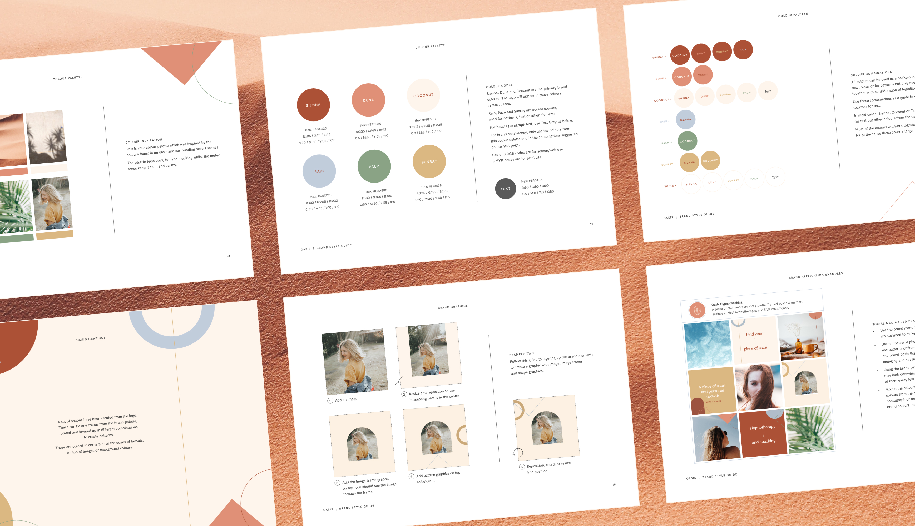
Soft textures, spacious type, natural geometry, and sun-warmed tones bring that balance into the visual world. The identity feels fresh for the category space. Even in the desert, with the right conditions, something new can take root.
 Coconut
 Sienna
 Dune
Dune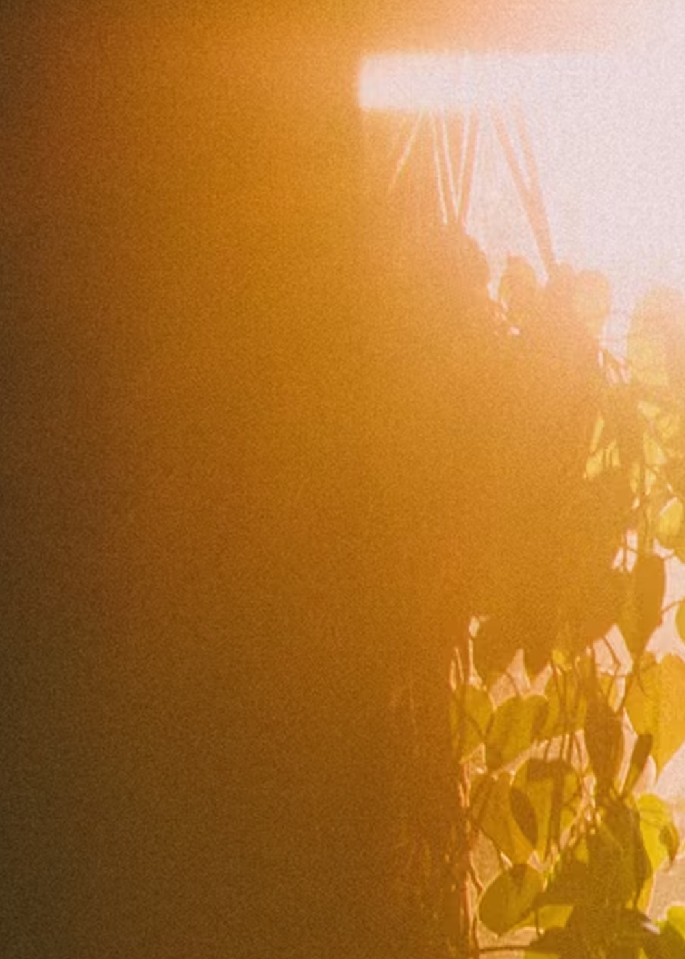 Sunray
 Rain
Rain Palm
Palm
A visual oasis
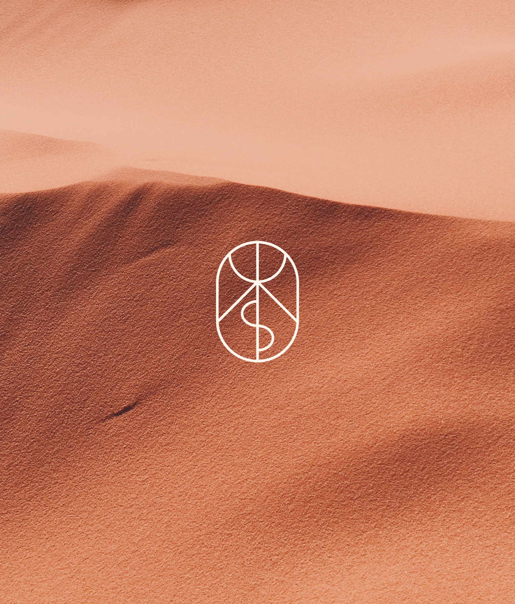
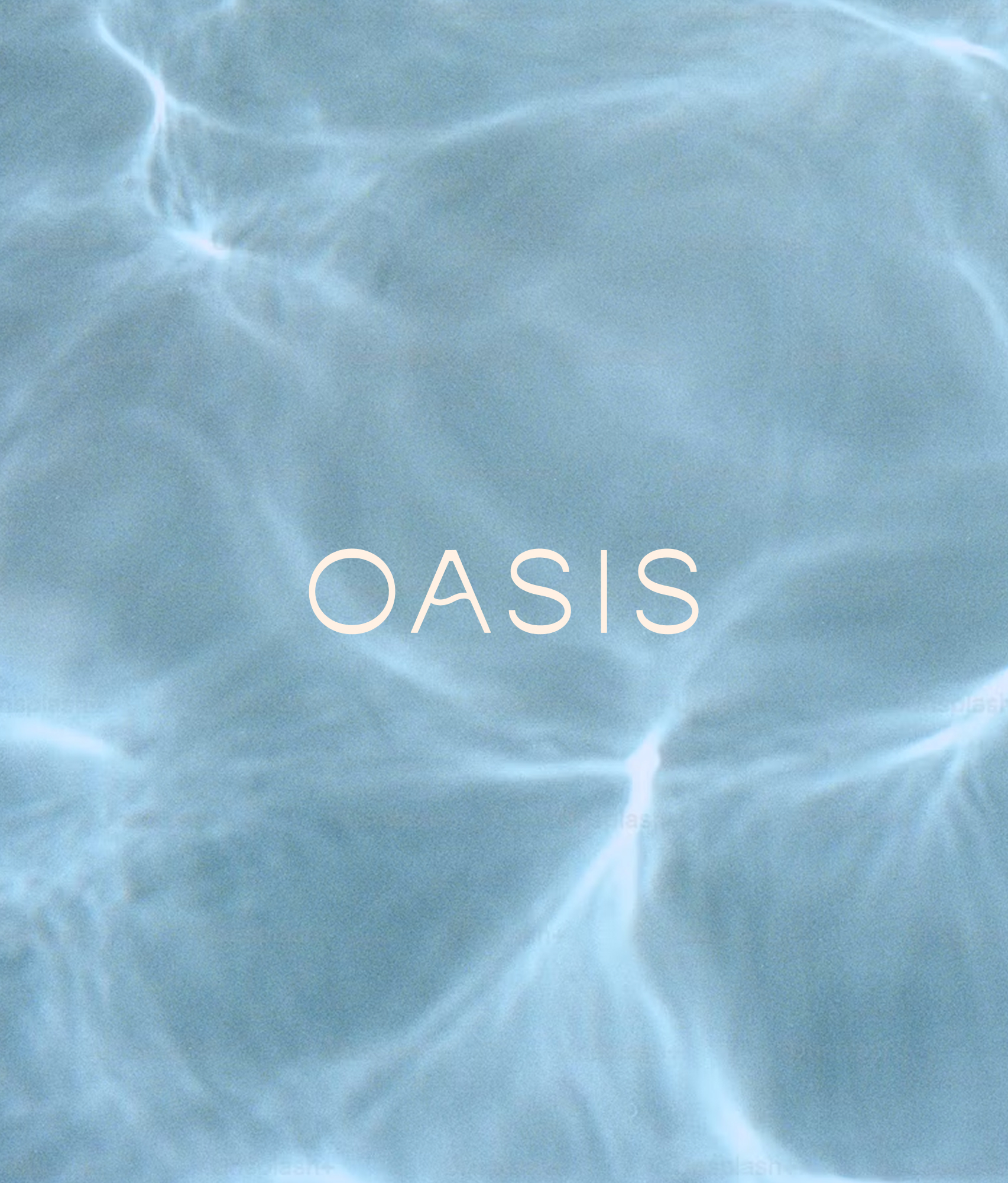
The logomark turns the letters of ‘OASIS’ into an abstract desert scene: the sun above a dune or a ripple of water. A subtle wave runs through the wordmark, customised to carry that same movement.
A palette drawn from the landscapes evoked by the name feels centred and uplifting. Shapes pulled from the logomark appear across print and digital applications to suggest rhythm, with subtle animation on the website bringing that idea to life. Vertical lines in the typography act as visual pauses, giving the eye and the mind space to breathe.
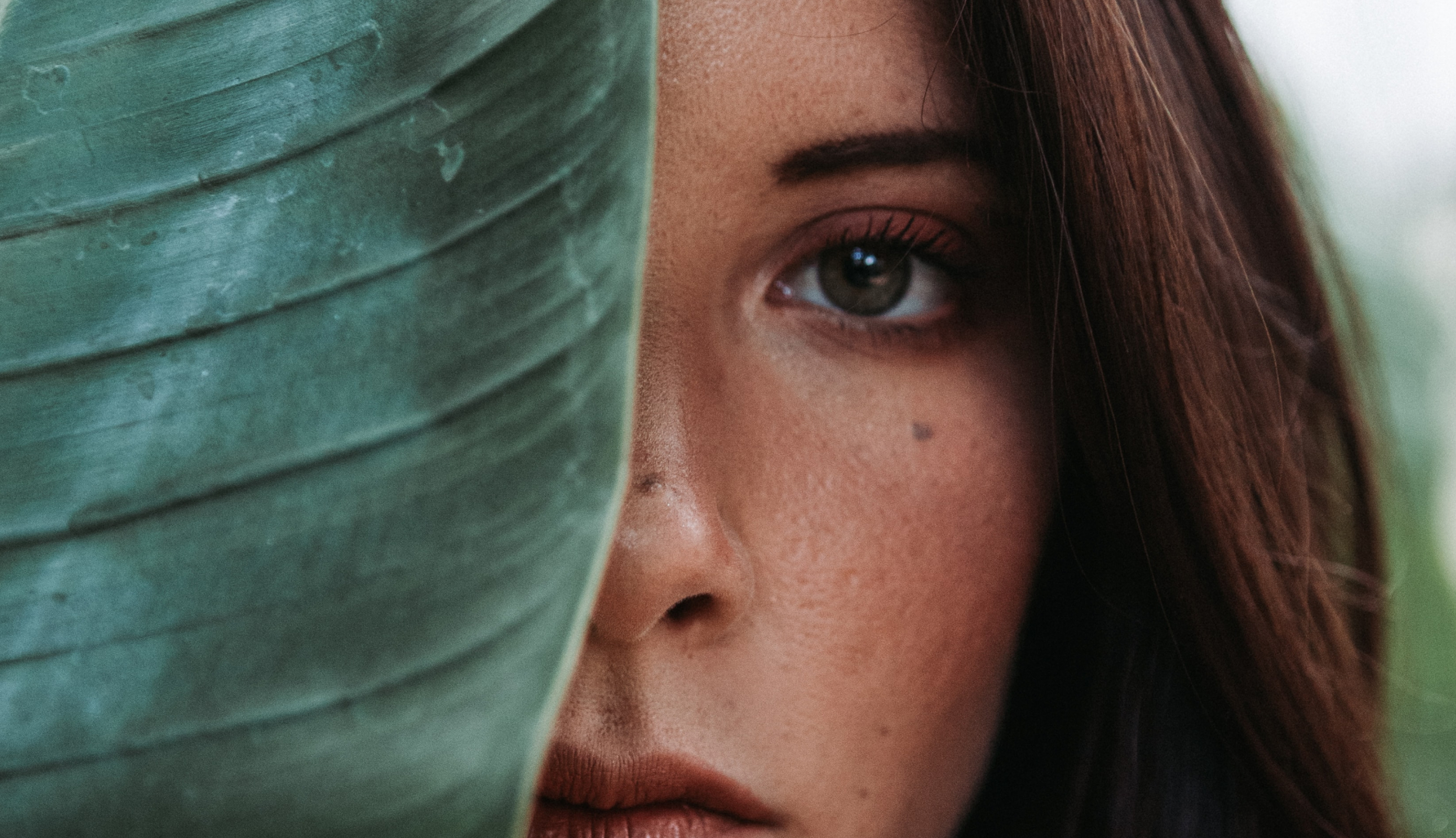
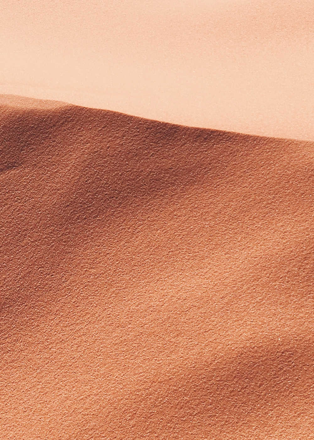
Combined with curated imagery of soft light on water, sculpted sand, and layered greenery, the world of Oasis feels earthed and full of possibility.