
The Nagundo Tree
The Nagundo Tree is a floral design studio founded by Ash, who grows, designs, and repurposes flowers into joyful creations spanning artful installations, delicate wreaths, and hand-dyed linens.
Ash came to me with a bold vision, inspired by the 70s, her family's carnival and flower-selling heritage, and a name from her childhood stories. The studio itself is a celebration of creativity and the changing seasons of Mother Earth. She wanted an identity that could hold all of this: colourful and retro, but fresh and authentic too.
Wild Roots
The design direction, Wild Roots, brings together the flower-power of the 70s with colourful carnival posters and traveller-style wagons, pulled from her family history of flower selling and life on the road.
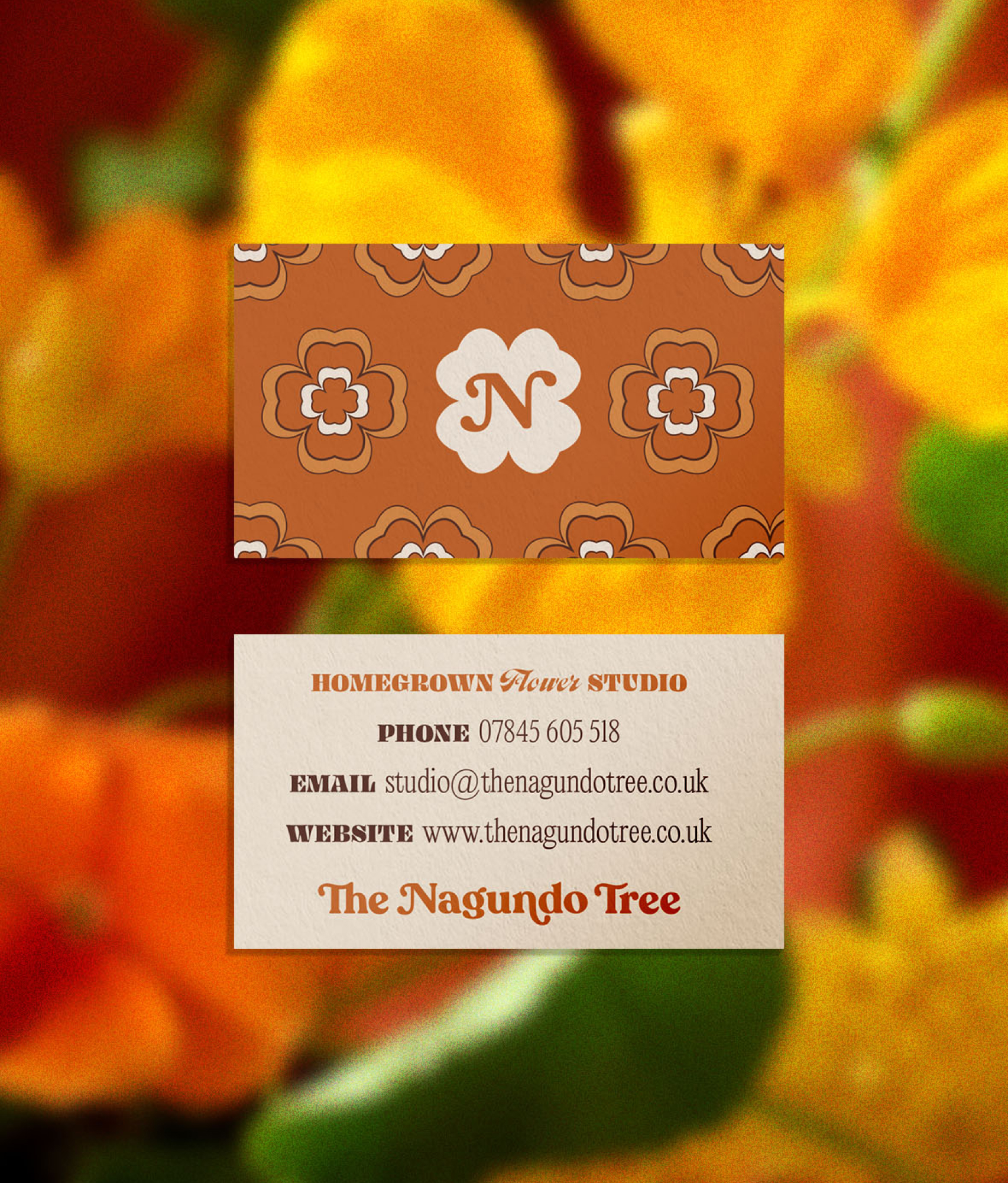
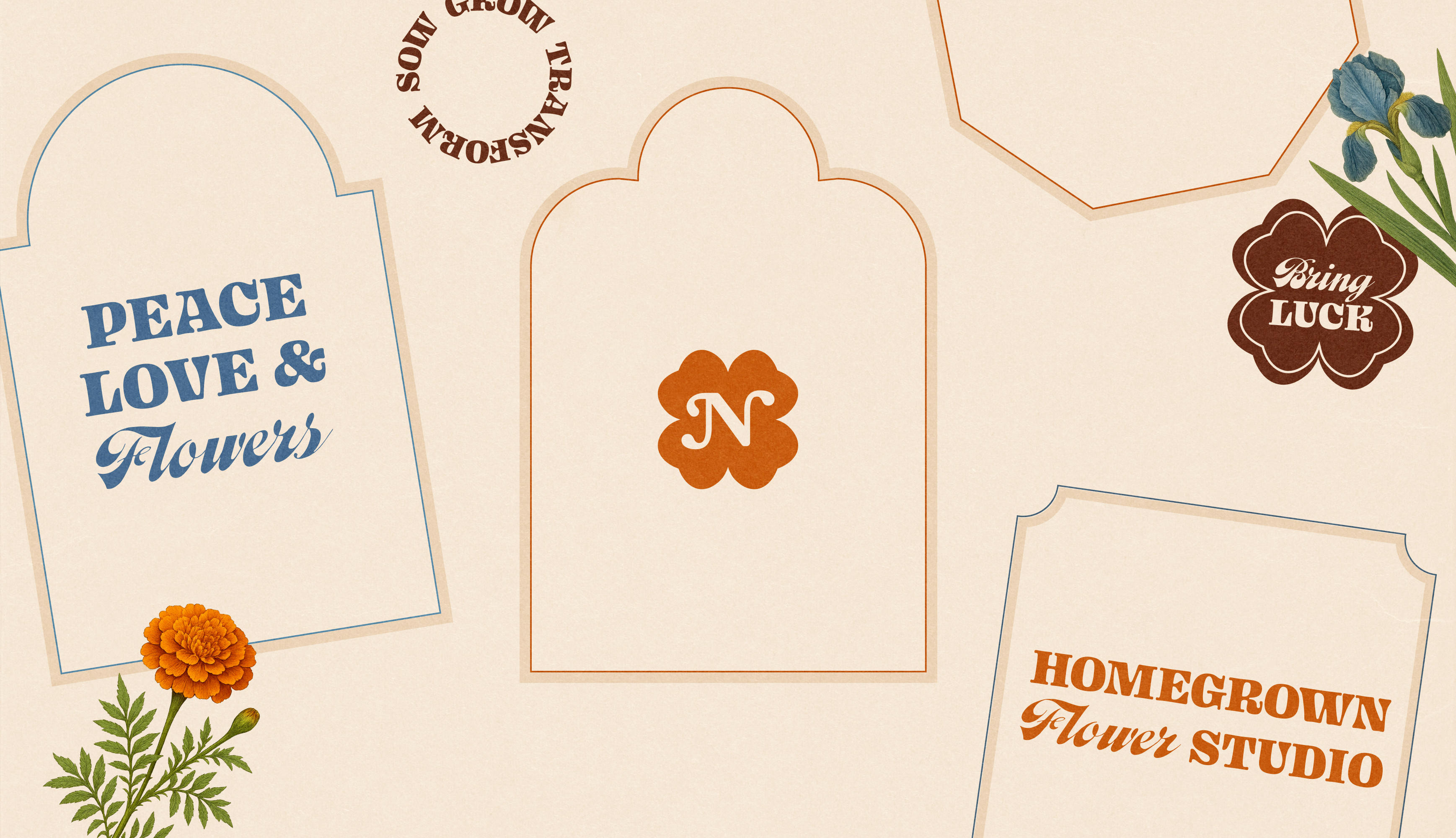
At the heart of the identity sits a logo mark inspired by a clover-shaped necklace engraved with ‘Bring Luck’, inherited from her grandad.
The result takes from the 70s and the carnival without being a pastiche of either. It's a brand that feels nostalgic and new at once, and reflects the way Ash works. Every flower earns a second life, from seed to story.
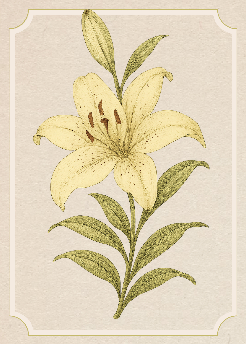 Lily
Lily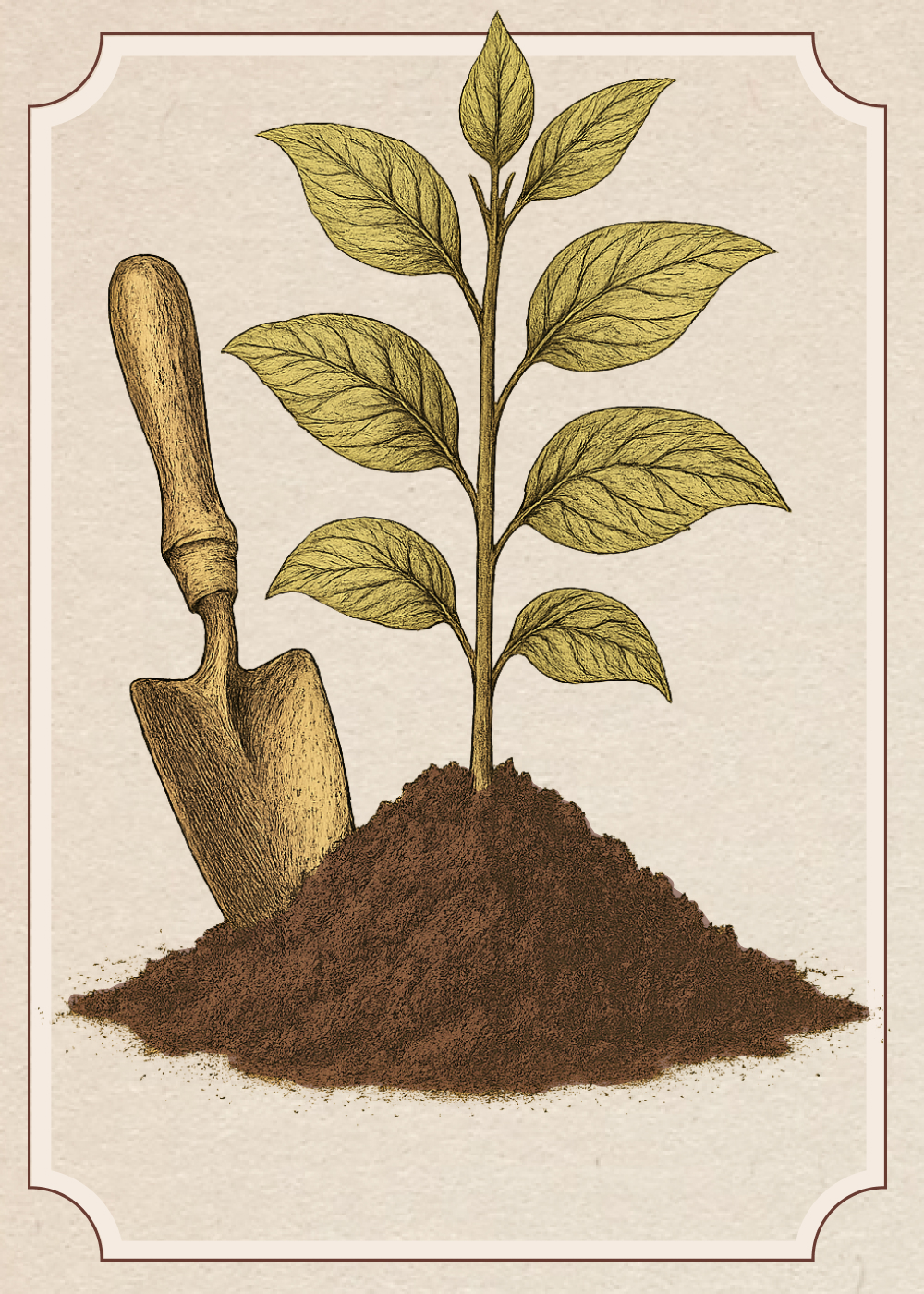 Earth
Earth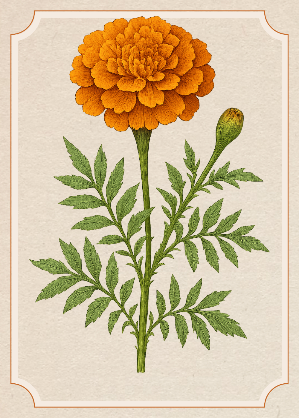 Marigold
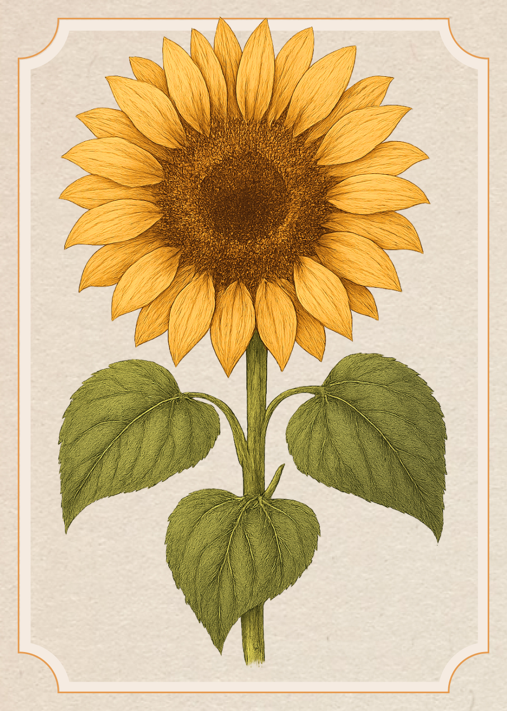 Sunflower
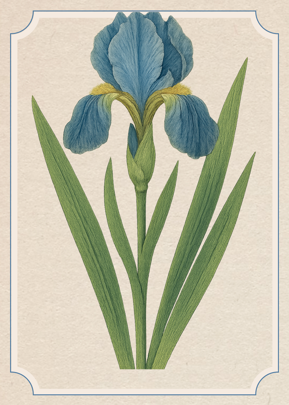 Iris
Iris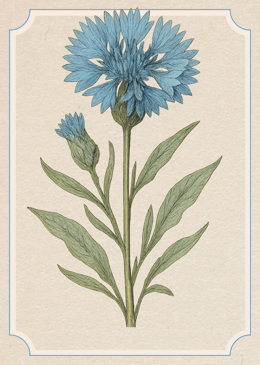 Cornflower
Designed to bloom
The identity is designed to feel like stepping into Ash's world.
The clover mark pairs with a retro-inspired logotype, so the brand can be a full signature or a single lucky charm.
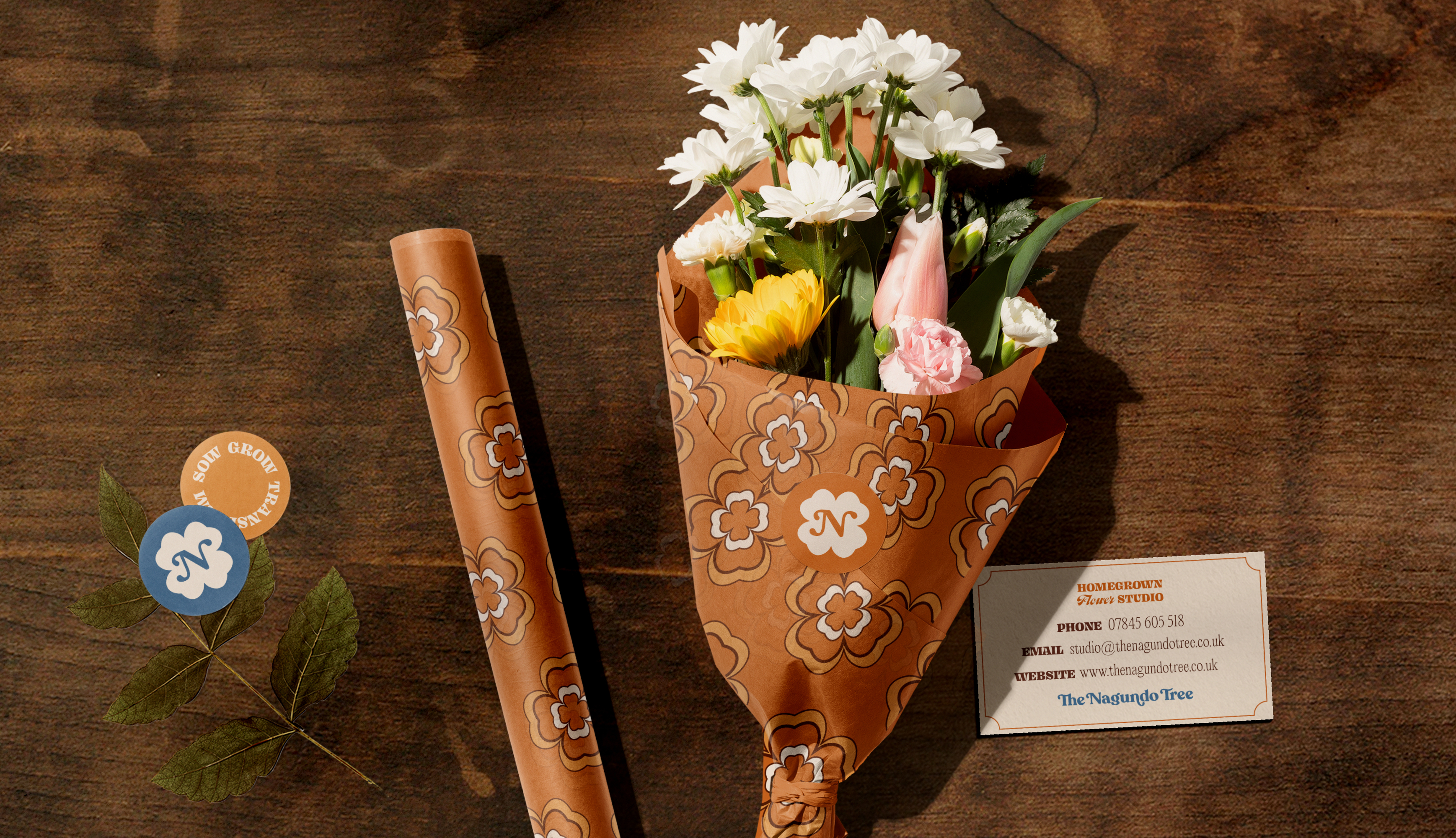
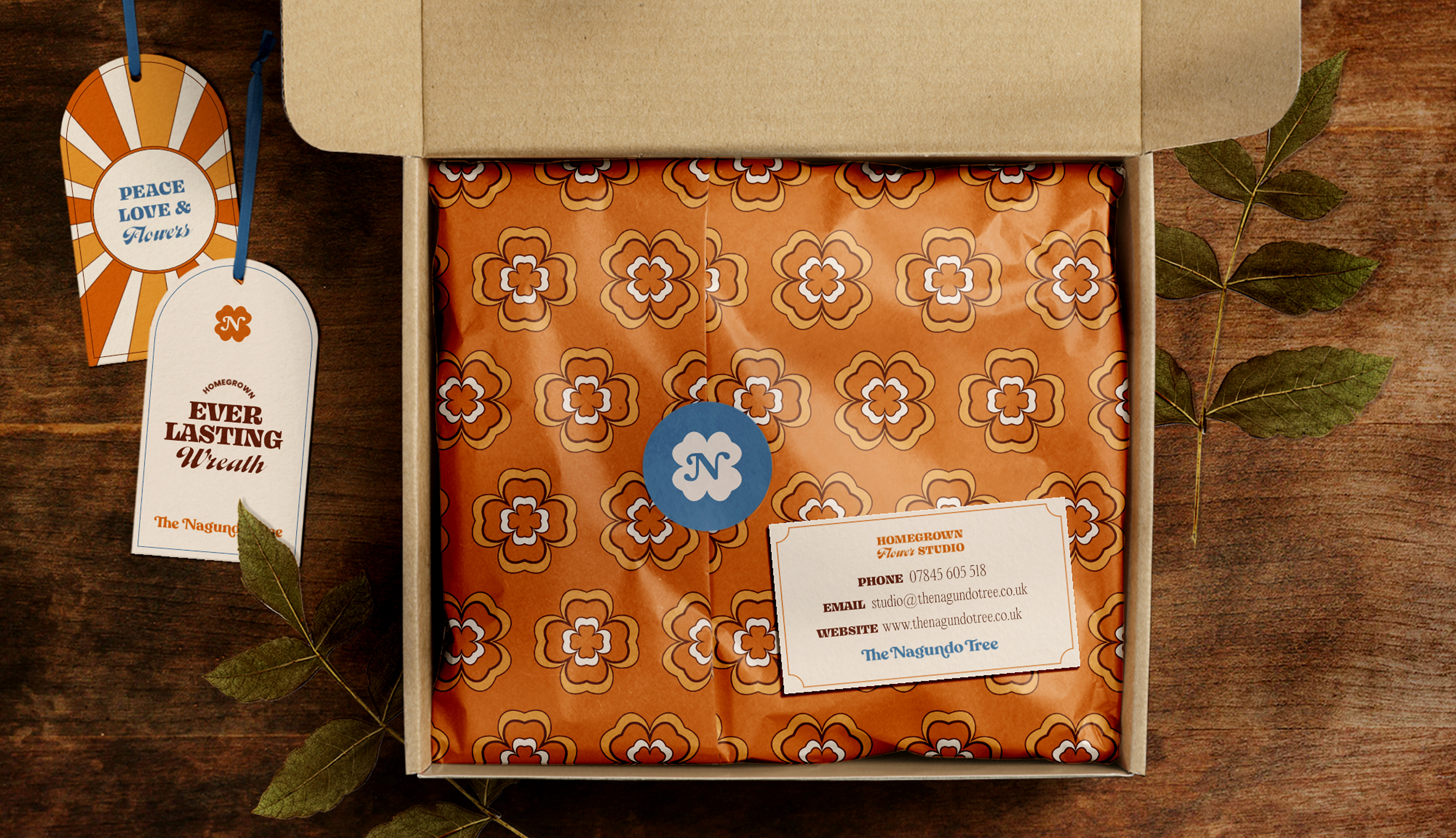
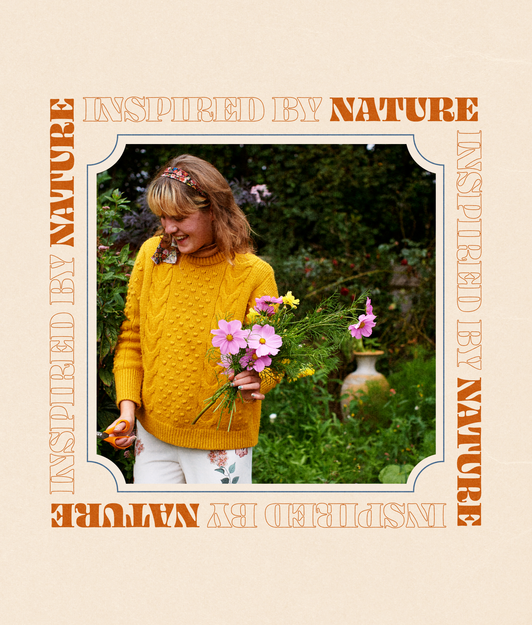
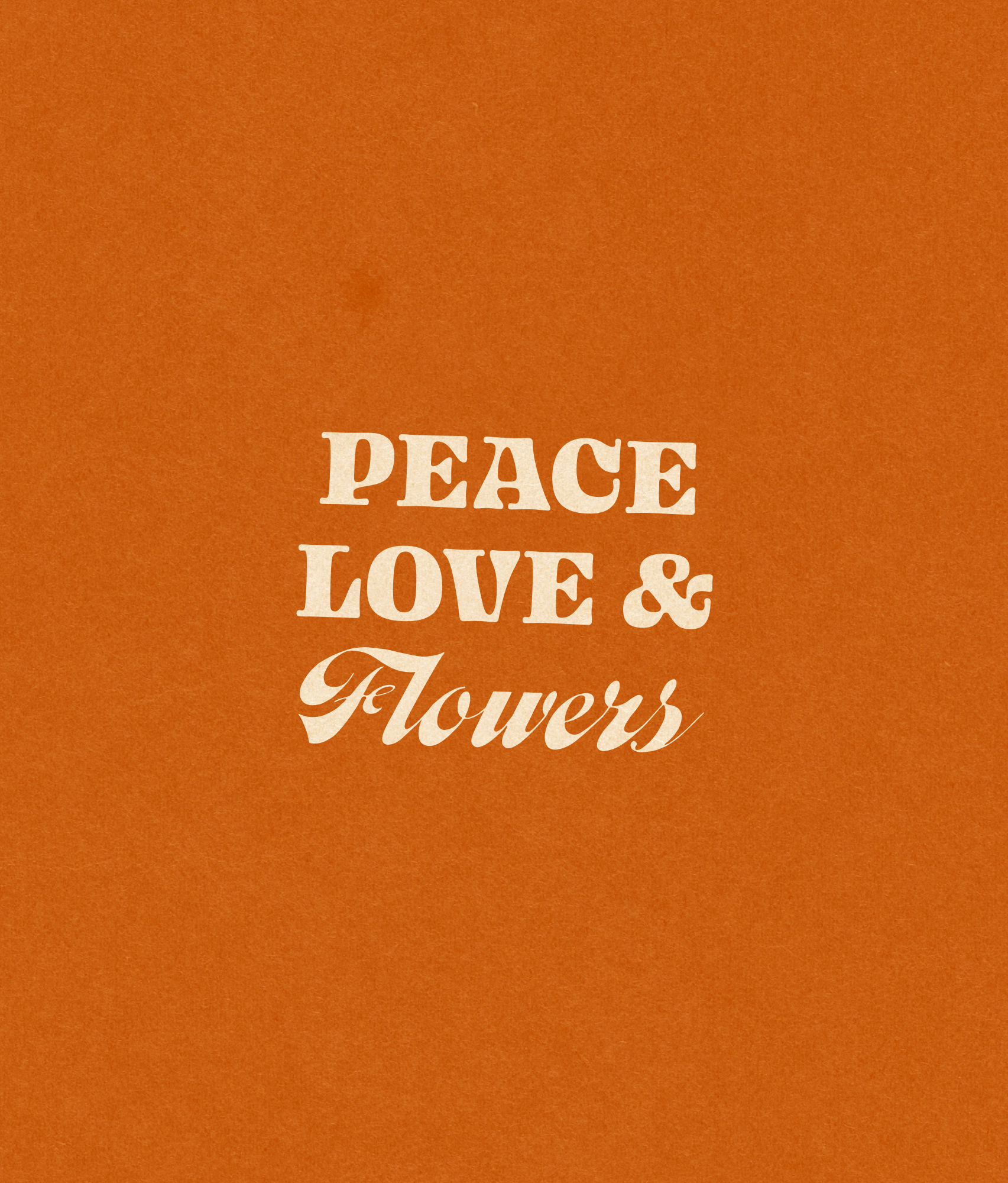
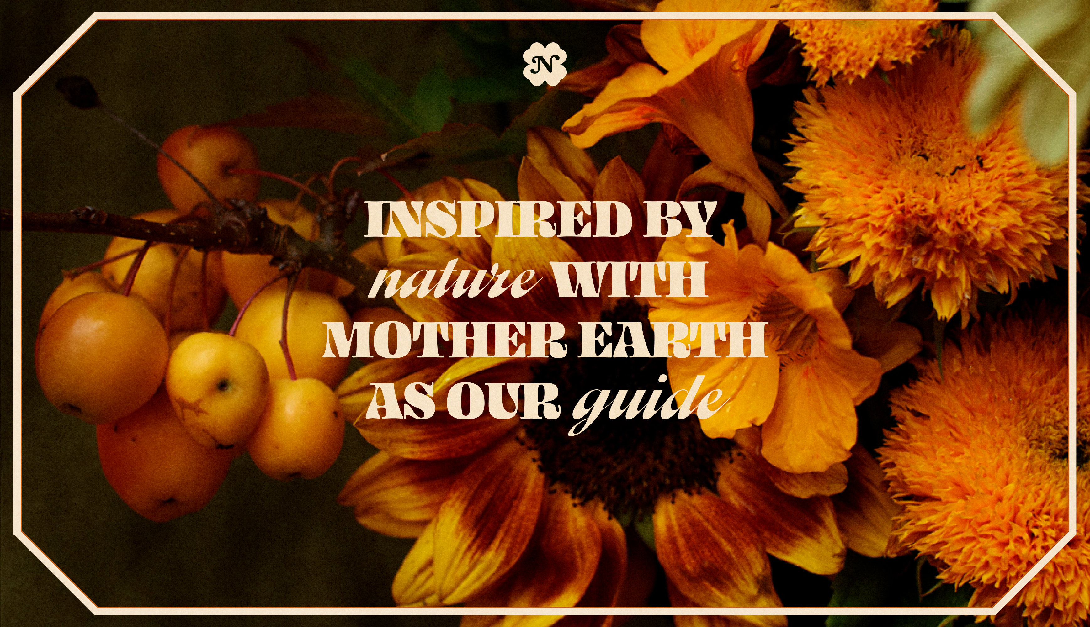
Typography borrows from vintage carnival posters, playful and full of character. Image frames echo hand-painted wagon signs. Submarks and phrases like Peace, Love & Flowers add flexibility and personality, building a layered system.
Warm earth tones meet floral oranges and sky blues in a palette both nostalgic and vibrant, a scheme lifted from Ash's garden and her personal style. The result is a celebration of the 70s and the joy of living colourfully.