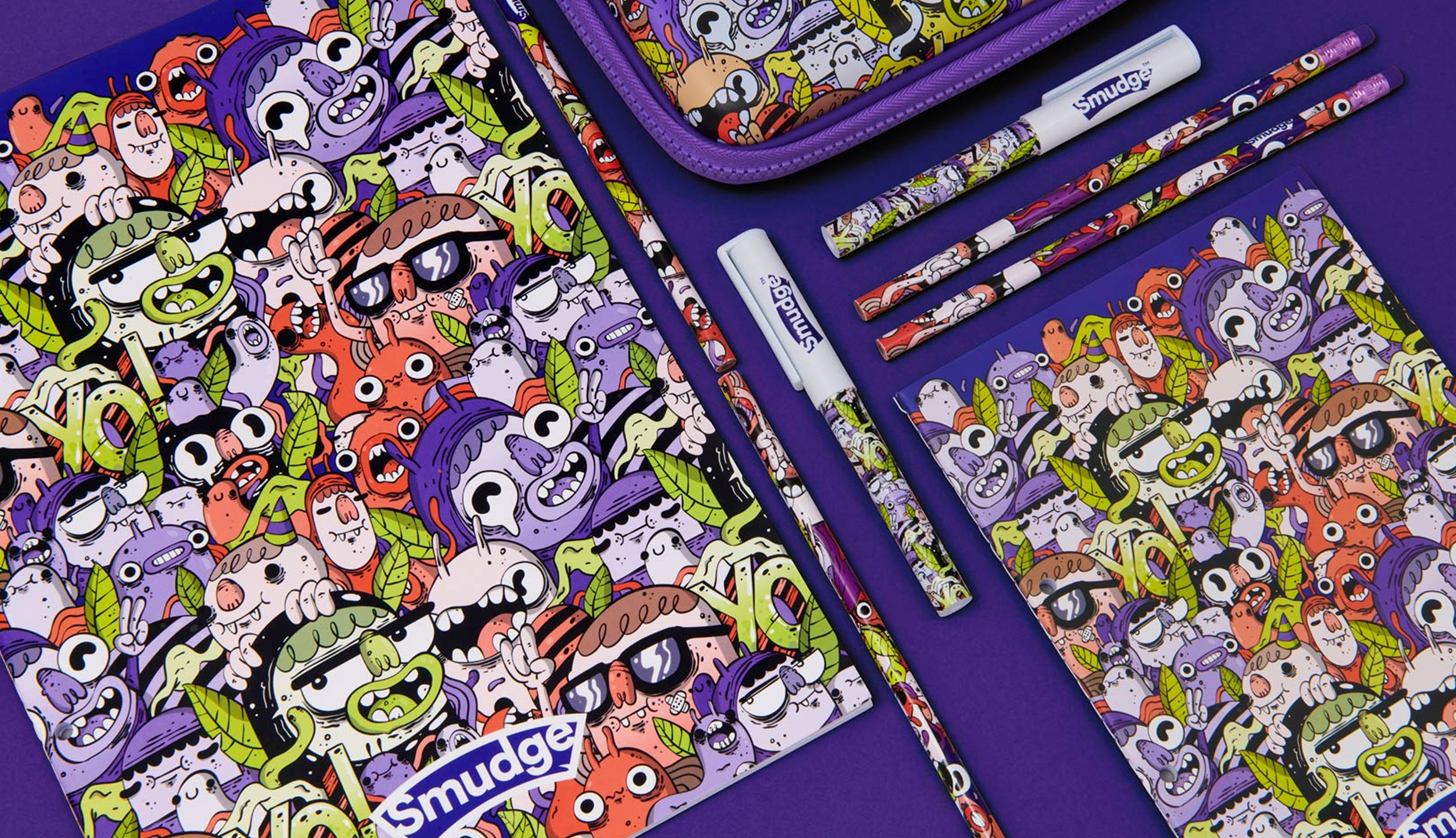
Smudge
Smudge is a stationery brand for kids who scribble and experiment, not for staying inside the lines.
Founded by two dads, they set out to create something that reflected their own kids. Something cooler, more creative and collectible, than the pastel, cute cartoon characters found across the high street.
I worked on Smudge at Fresh Lemon, as part of the branding team under the studio’s creative direction. From early concepts through to packaging, print materials and social rollout, I helped shape a brand world that was built to stand out.
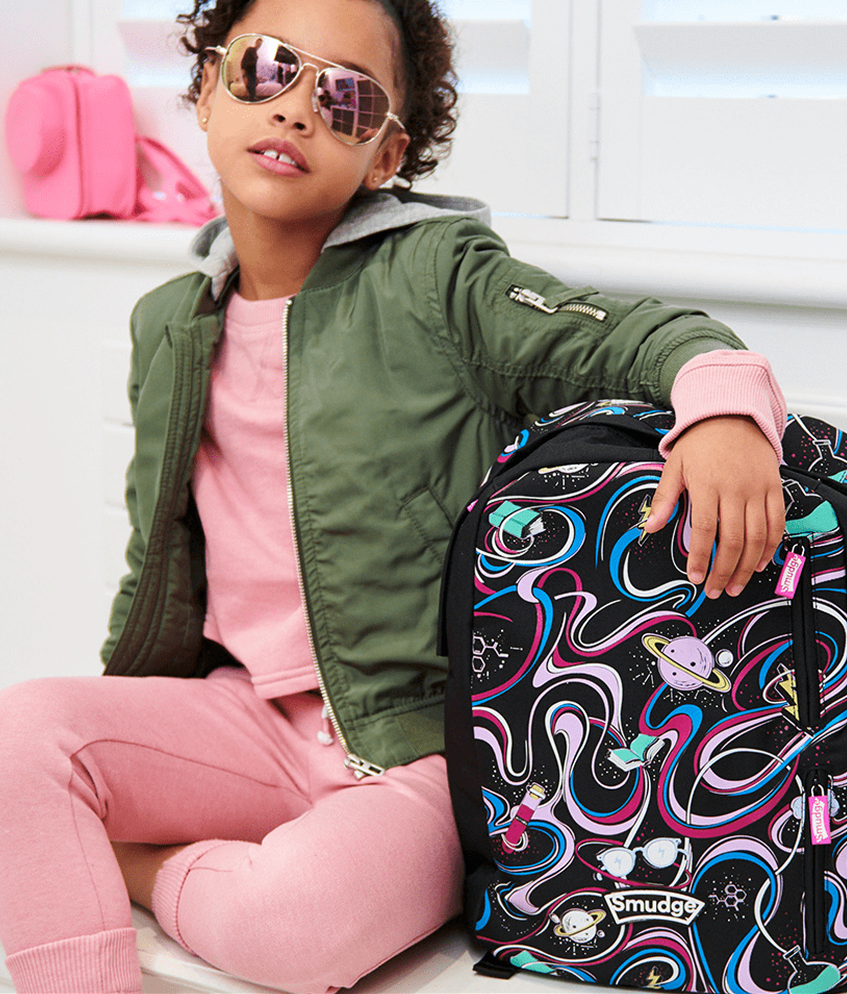
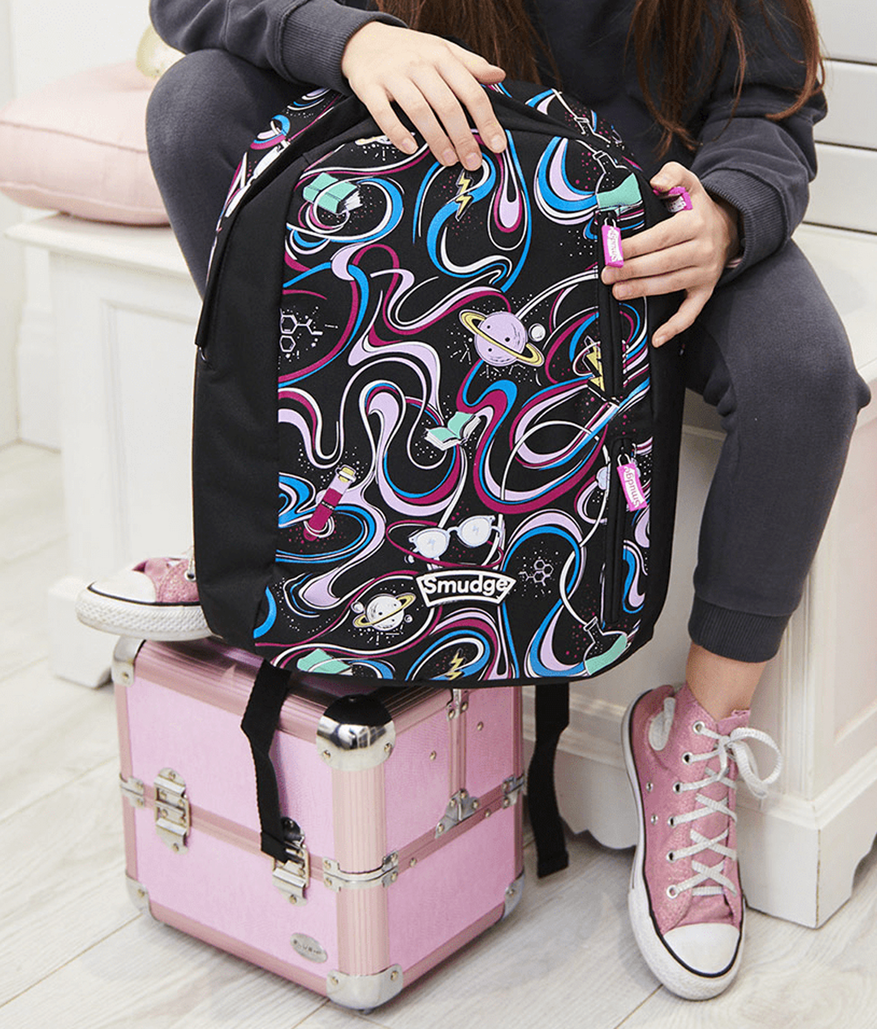
Make your mark
‘Make your mark’ began as a working tagline, capturing the creativity and confidence that Smudge stood for. And not being afraid to make a bit of a mess.
The team gathered references that felt more street than sweet. Scuffed trainers, skateboards, and doodles outside the margins filled the moodboards.
I was especially drawn to the tactile side of the concept and used ‘make your mark’ as a guide to experiment with real mark-making using the products themselves. One of those early explorations formed the basis of the final logo, later refined in the studio, while other smudges and scribbles fed into the wider brand.
 Blueberry
 Grape
Grape Bubblegum
 Peppermint
 Grape → Bubblegum
 Grape → Peppermint
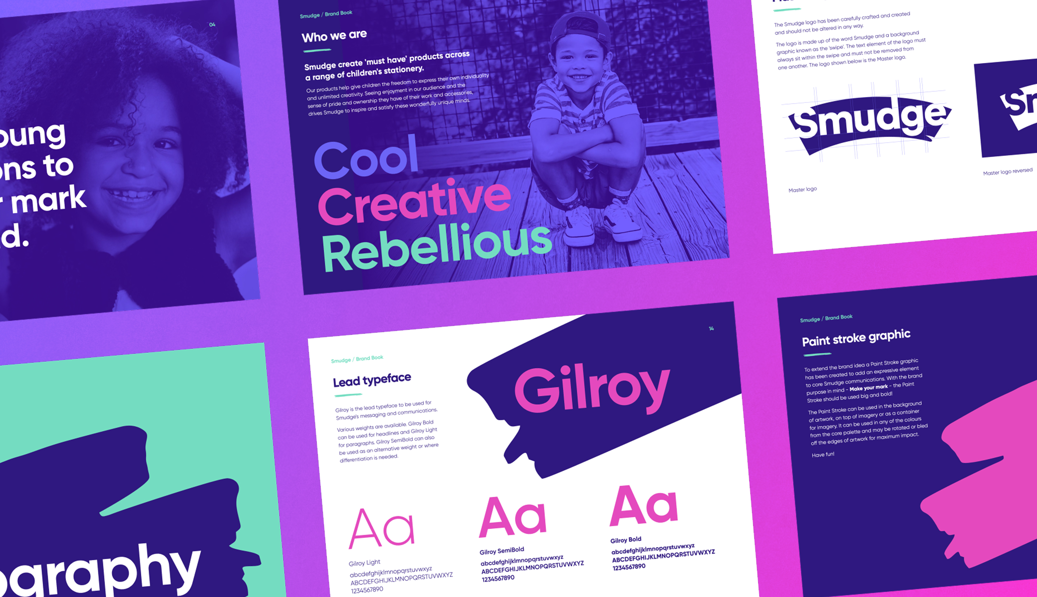
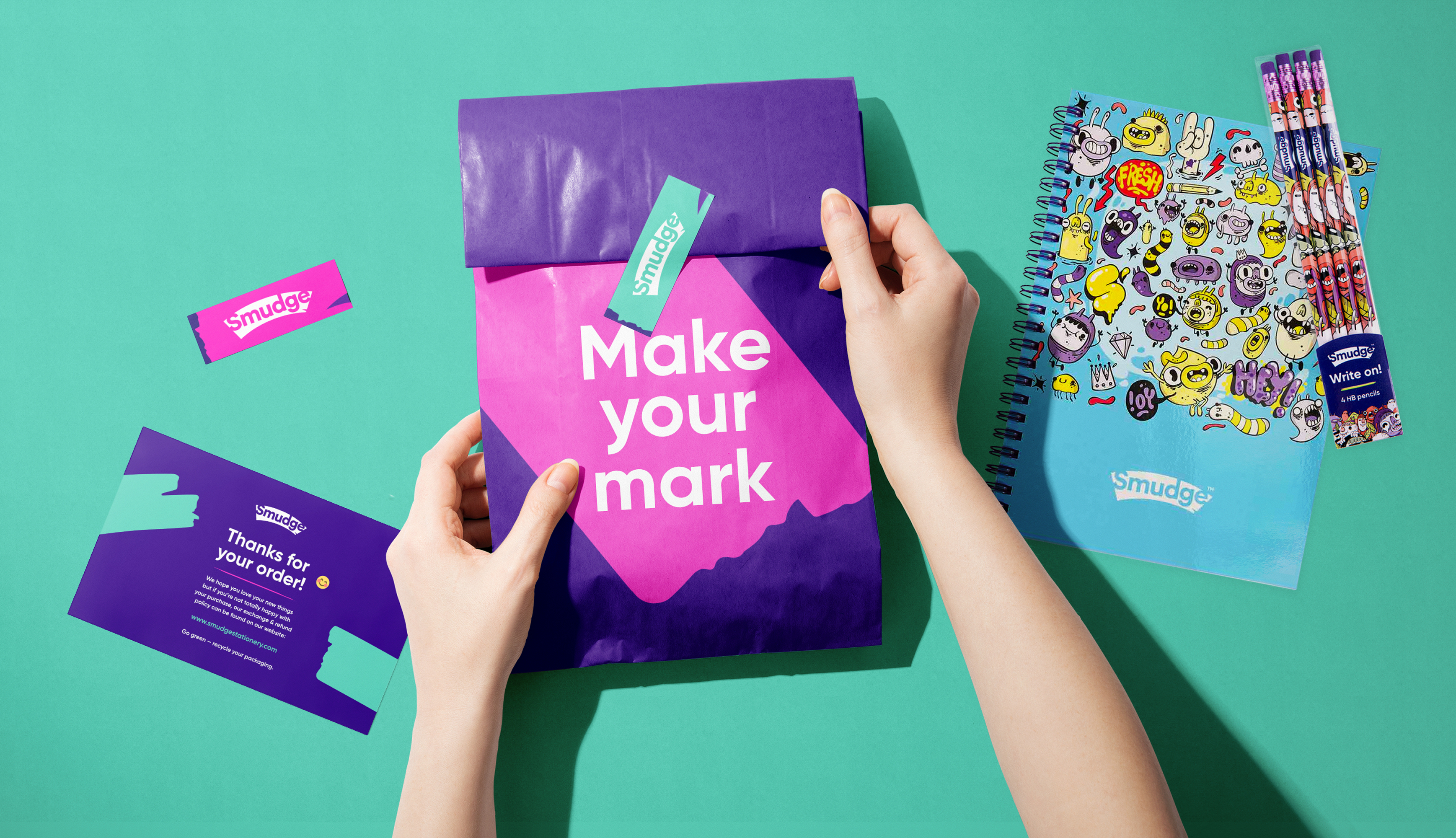
Scribbles and stationery
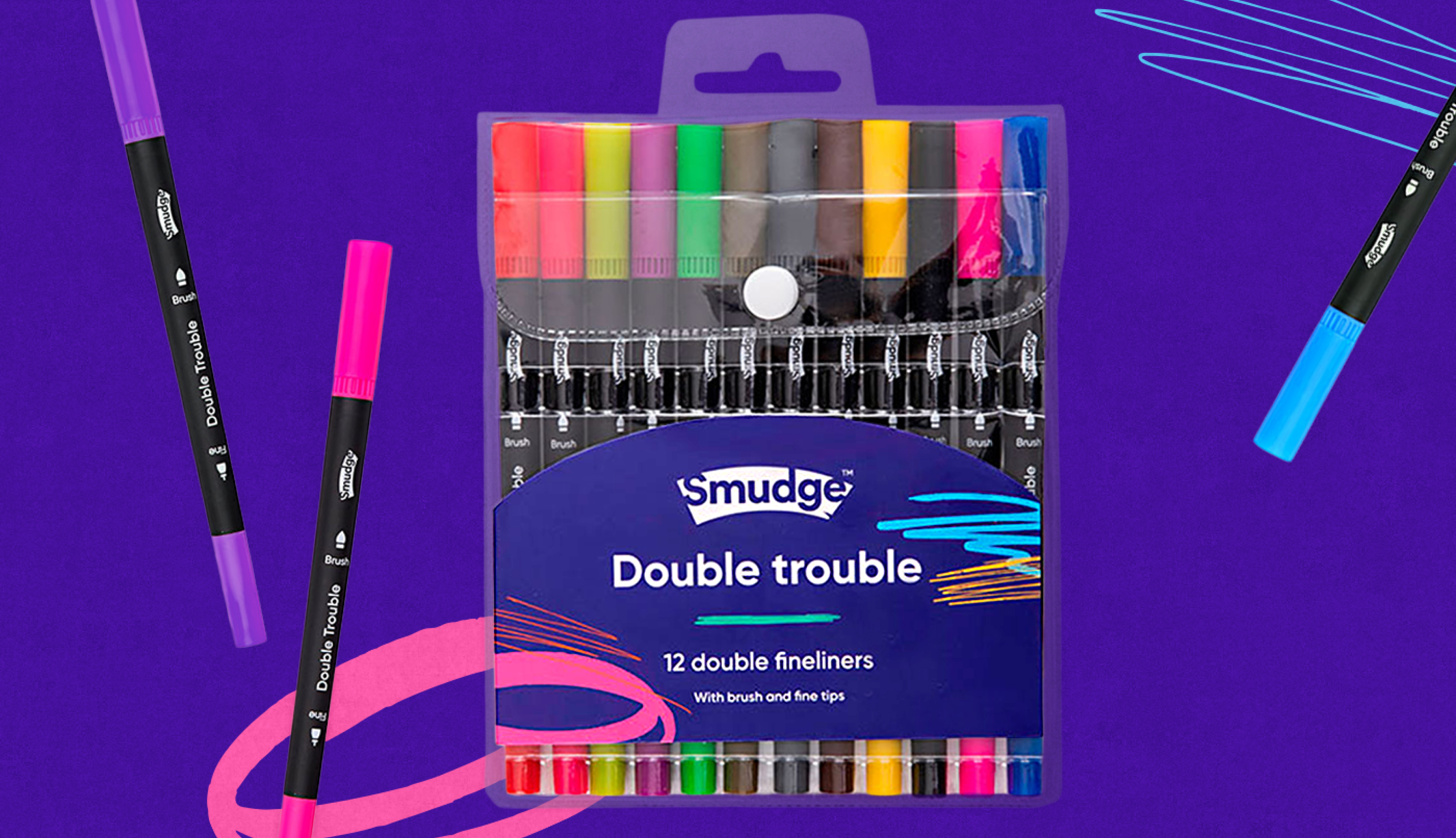
The final identity combines a clean, confident wordmark with a bold colour palette, brought to life by scribbles made using the actual stationery. It’s bright and full of energy, just like the kids it was made for.
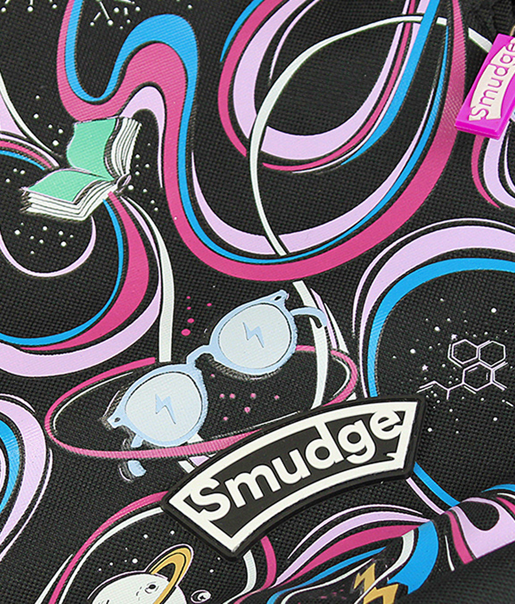
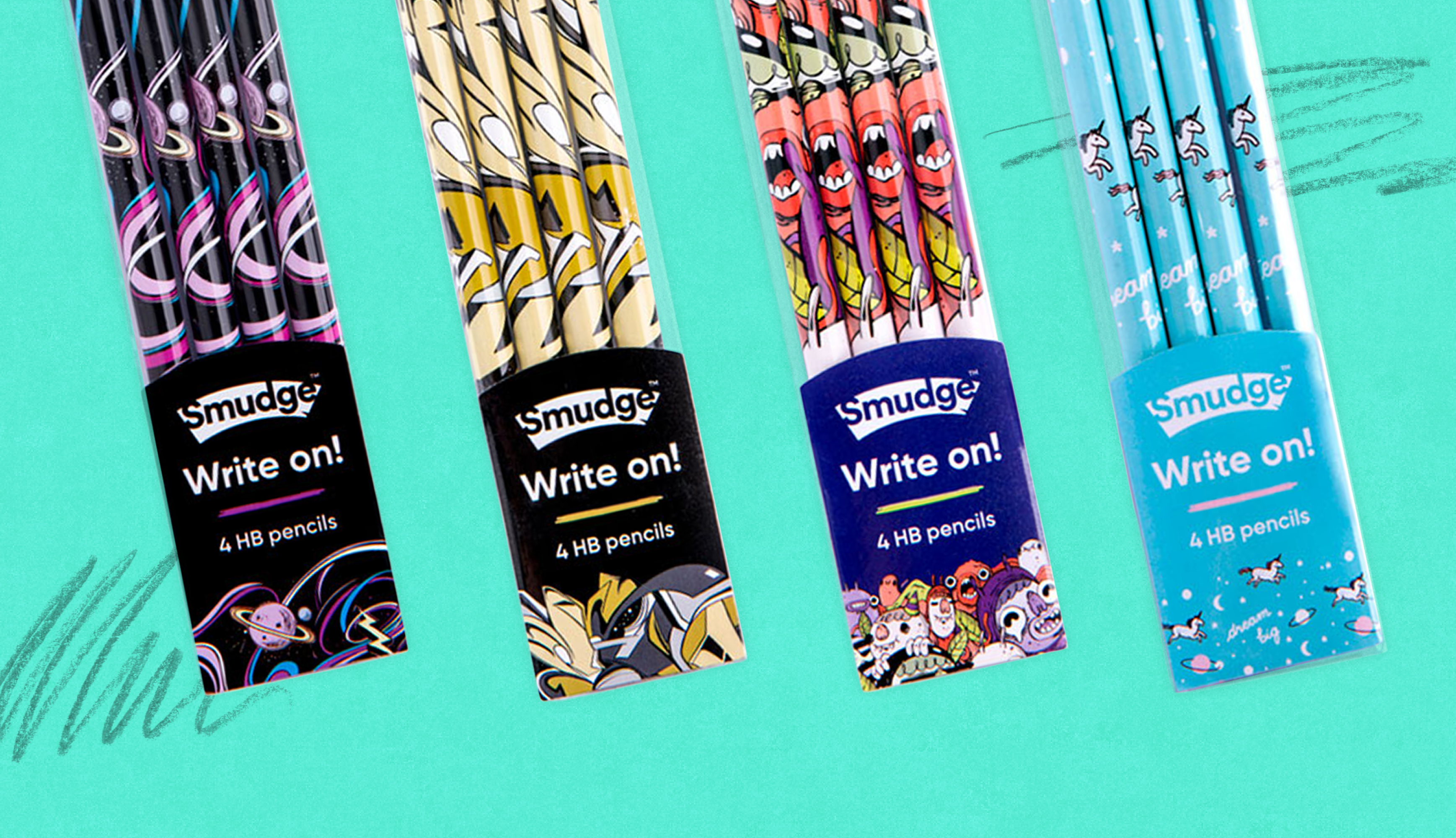
Alongside Smudge’s house style, each product collection has its own personality, led by commissioned illustrators and supported by a flexible typographic system.
I worked on rollout, like brand guidelines, and applying to packaging, print materials, and social assets.
The result is a system that stays true to the brand’s identity while making space for every collection to feel fresh. Always messy, always creative, and always ready to make a mark.